ResidentialBusiness
Administrators
-
Joined
-
Last visited
Everything posted by ResidentialBusiness
-
With macOS Sequoia 15.4, Apple fully rolled out all of its new Apple Intelligence features to the Mail app. As such, when you open Mail after updating to the latest OS, the app will look quite different. You'll see new "Mail Categories," a Priority Messages box, and email summaries, the latter two of which are powered by AI. It's not something many asked for, and you might be longing for the Mail app you're used to. But there's good news here: If you don't like these features, you can easily disable or customize them to suit your needs. How to disable Mail Categories on Mac Credit: Khamosh Pathak Apple first added Mail Categories to the iPhone back in iOS 18.2. After a few rounds of updates, it's now front and center on the Mac, too. This feature automatically sorts all your emails into four neat boxes: Primary, Transactions, Updates, and Promotions. Apple's positioning for this feature is a bit weird. While Apple is using on-device processing to sort out these emails, it's not actually an Apple Intelligence feature. So, turning off Apple Intelligence on the Mac won't instantly get rid of this feature, either. The idea is that Apple does all the heavy lifting to figure out which emails are most important and useful, and presents them to you in the Primary box. It mostly works, but it isn't always accurate. Credit: Khamosh Pathak If you want to see all your emails at any given time, swipe right on the trackpad or Magic Mouse while hovering on the Categories tab to switch to the All Mail tab. This tab presents your messages in chronological order, as you're used to. But that might not be enough. If you want to disable the Categories view altogether, click the three dotted Menu button at the top of the Mail list, then uncheck Show Mail Categories. After that, the Mail list will be back to how it used to be. How to recategorize emailIn case you do like this feature and want to keep it around, here's a tip for when things go a bit wrong. In case the Mail app incorrectly categorizes an email, you can take a bit of manual control and point the app in the right direction. Credit: Khamosh Pathak Right-click on an email in the Mail list, then choose Categorize Sender. Here, choose the category where you want the email to end up in. How to disable Priority MessagesWhen you receive a time-sensitive email, or something that Apple deems significant (like an email from your company, or your family member) it will show up in a new Priority box on top of the Mail list. Credit: Khamosh Pathak If you don't like this feature, there's a quick way to disable it as well. Click the three-dotted Menu button on top of the Mail window, then uncheck Show Priority Messages. How to disable AI summary previews Credit: Khamosh Pathak Apple now provides a short summary for each email instead of showing you the first couple of lines. This too, is hit or a miss. Just like Notifications Summaries on iPhone, these Mail summaries can sometimes go horribly wrong, as the app changes the meaning of the message completely. Credit: Khamosh Pathak If you don't like this feature, here's what to do: Go to Mail > Settings (Command + Comma) from the menu bar, and switch over to the Viewing tab. Here, uncheck Summarize Message Previews to get rid of Mail summaries. How to disable all Mail AI featuresLastly, there's the nuclear option. To turn off all AI features in Mail, you can simply disable Apple Intelligence on your Mac. In one fell swoop, you can get rid of the Priority mail box, AI summaries, and the Summary button in emails, as well as hidden features like Apple Intelligence Writing Tools and Smart Replies options. Credit: Khamosh Pathak To do this, open System Settings, go to Apple Intelligence & Siri and disable the Apple Intelligence toggle. From the popup, click Turn Off Apple Intelligence to confirm. Of course, when you do this, you'll also miss out on the new Siri design, Writing Tools, Gemmoji, Image Playground and more. But if you don't care for these AI features anyway, better to just keep them off completely. View the full article
-
We may earn a commission from links on this page. Deal pricing and availability subject to change after time of publication. Bose makes speakers that have been dominating their space since their release—and when it comes to portable mid-size rugged speakers, the Bose New Soundlink Flex has been one of the best since its release in 2021, and is still very competitive three years later. Right now, you can get it for $119 (originally $149), the lowest price it has been according to price-tracking tools. Bose New SoundLink Flex Battery Life 12 Hours, Included Components USB-C, Is Waterproof True, Item Weight 1.2 Pounds. $113.00 at Amazon /images/amazon-prime.svg $149.00 Save $36.00 Get Deal Get Deal $113.00 at Amazon /images/amazon-prime.svg $149.00 Save $36.00 The Bose New SoundLink Flex is the middle sibling between the oldest (but smallest) Bose SoundLink Micro, and the youngest (but biggest) Bose SoundLink Max. The Flex also strikes a good middle ground between them as far as portability and sound, making it the best portable speaker for most people. The Flex has an IP67 rating, which means you get complete water and dust-proof protection. The speaker even floats in the water, so you can bring it with you in the pool. While it doesn't have full EQ customization in its companion app, the sound it offers is clear with rich bass depth and clear highs out of the box, according to PCMag's review. It also has a speakerphone, so you can take calls with it and even speak to it, thanks to its microphone. Although it's older, it comes with a USB-C charger, so it will charge quickly. At 3.6 by 7.9 by 2.1 inches (HWD) and 1.3-pound, it is light and portable. The Bluetooth 4.2 supports SBC codec, but not AAC or AptX, so it is more suitable for Android users than for Apple users, but either works. The SoundLink Flex is perfect for those who want to take their speaker with them anywhere, thanks to its small size and light weight. And for the price, it offers some of the best audio available. View the full article
-
In a speech at the American Bankers Association Washington Summit Wednesday morning, Treasury Secretary Scott Bessent downplayed economic risks from tariffs, floated capital reforms, and urged regulatory relief for community banks. View the full article

-
Italian fashion group set to announce cut price $1.38bn tie-up with Capri-owned house as soon as ThursdayView the full article
-
A pullback from US Treasuries sent longer-term yields surging by the most since pandemic struck in 2020, deepening losses in what's supposed to be a haven from financial turmoil and roiling markets abroad as investors sell government bonds to raise cash. View the full article

-
And how they can maul usView the full article
-
The double whammy of falling bond and equity prices could partly be hedge funds unwinding so-called ‘basis trades’ View the full article
-
So long, sweet priceView the full article
-
The Start menu is the gateway to everything on a Windows PC, from files to apps to settings, and it looks as though Microsoft is planning a substantial refresh for the menu's interface. Changes have been spotted in the early testing versions of the operating system by tipster @phantomofearth, and should eventually appear for everyone. As it stands today, the Start menu shows a search bar up at the top, then you've got two other sections: Your pinned apps, and your recommended links (usually to files you've recently opened or apps you've recently used). Both those sections can be expanded with a click to show more programs and files. How the Start menu looks today. Credit: Lifehacker The version of the Start menu now in testing expands what you can see and access straight away. You get your pinned apps, your recommendations, and then a list of every app that's installed—this full app list no longer needs an extra click. This full list of programs can appear as a standard alphabetical list, as a grid grouped by app name, or as a grid grouped by category (a bit like the App Library on iOS). Further customization options available in the updated Start menu let you increase the size of the pinned app section, and remove the recommended section entirely—neither of those options were available before. It means a more flexible approach for users, and easier access to apps, at the expense of some extra screen space. This Tweet is currently unavailable. It might be loading or has been removed. The reaction to the upcoming changes seems to be mostly positive, especially when it comes to getting to the full Start menu list more quickly. You've still got the search box up at the top of the menu panel, so you can jump to specific apps if you know what you're looking for, but the revamped approach is more convenient. There's no word yet on when everyone is going to get these changes, but given how significant they are, Microsoft may well wait a while to refine the new interface approach. The version that ends up rolling out to everyone might not look like the screengrab I captured, which you can see at the top of this article. Testing out the new Start menuMost people will be content to sit tight and wait for the new Start menu to roll out officially, but if you're keen to test it out now, it's not too difficult to do. Bear in mind though that this does involve beta software and some additional hacking, so do this at your own risk—I wouldn't recommend doing this on a computer you rely on every day. First you need to join the WIndows Insider Program, which is free to do: You can do that on the web here by logging into the Microsoft account that's linked to your laptop or desktop. Follow the instructions on screen, and when you're redirected to the Windows Update section of Settings in Windows itself, choose the beta channel. The new Start menu can be set to just show apps. Credit: Lifehacker You should then shortly see new updates available to install, which will put the beta version of Windows 11 on your computer after a restart or two. This new Start menu isn't yet enabled in the beta channel though, even though it's been spotted inside the operating system code, so you need to apply some extra tweaks to get it working. Those tweaks can be applied with a third-party utility called ViVeTool, which you can download from here. When it's up and running on your system, click Advanced Options or press F12, and then enable the following features (as per instructions from @phantomofearth): 49221331, 47205210, and 49402389. If that doesn't work, try enabling 48433719 before the other three. There are additional settings attached to the new Start menu. Credit: Lifehacker After another restart, you should get your new Start menu, as well as the additional options—which you can find by opening Settings and choosing Personalization > Start. It's possible to turn off all the recommended and pinned items and just have your full list of installed apps if you want, which is reminiscent of the old Windows 8 approach. Having spent a few hours testing out the new Start menu, it certainly feels more comprehensive to me, with every app available straight away in an interface that doesn't feel too busy or cluttered. More customization options have to be welcomed as well: I can't see myself using the Category view much, for example, but it's easy enough to change. View the full article
-
Jump in yields on 30-year gilts came as investors dumped US Treasuries after concluding country had ‘lost control of its senses’View the full article
-
US mortgage rates fell to the lowest level since October, spurred by a rally in government bonds in the wake of an escalating trade war and driving home purchase applications to a more than one-year high. View the full article

-
Microsoft has released its April 2025 Patch Tuesday update, which fixes 134 malicious bugs across its systems—including one zero-day exploit. Windows and Microsoft users should ensure their devices are up to date with the latest patches. Patch Tuesday updates for April 2025One of the vulnerabilities fixed this month was a zero-day, which is a flaw that is exploited or publicly disclosed before an official patch is released by developers. The active exploit—labeled CVE-2025-29824—is an elevation of privilege vulnerability in the Windows Common Log File System (CLFS) Driver. The flaw, which was identified by the Microsoft Threat Intelligence Center, allowed attackers to gain SYSTEM privileges locally. According to reporting from Bleeping Computer, this zero-day was exploited by the RansomEXX ransomware gang. Microsoft has released a patch for Windows Server and Windows 11 and expects to notify users when security updates for Windows 10 for x64-based Systems and Windows 10 for 32-bit Systems. April's update fixes 49 elevation of privilege flaws, nine security feature bypass flaws, 31 remote code execution flaws, 17 information disclosure flaws, 14 denial of service flaws, and three spoofing flaws. Eleven of the remote code execution vulnerabilities were categorized as "critical" and were found across Microsoft Office, Microsoft Office Excel, Remote Desktop Gateway Service, Windows Hyper-V, Windows LDAP, and Windows TCP/IP. Microsoft also released patches to vulnerabilities in Mariner and 13 Microsoft Edge bugs this month. What Microsoft users need to doSecurity updates for Windows and Microsoft are usually downloaded and installed automatically, but you can check your PC's status by going to Start > Settings > Windows Update and selecting Check for Windows updates. Patch Tuesday fixes are released on the second Tuesday of every month at 10 a.m. PT, so now is a good time to ensure your system is up to date. View the full article
-
We may earn a commission from links on this page. Deal pricing and availability subject to change after time of publication. If you’ve been looking for a wireless outdoor camera that doesn’t need constant babysitting, the Arlo Essential Wireless Security Camera (2nd Gen) bundled with a solar panel is now at its lowest-ever price (according to price trackers)—$69.99, down from $99.99. Arlo Essential Wireless Security Camera $69.99 at Amazon /images/amazon-prime.svg $99.99 Save $30.00 Get Deal Get Deal $69.99 at Amazon /images/amazon-prime.svg $99.99 Save $30.00 Designed for DIY setup, it's fully wireless, with a built-in rechargeable battery and a USB-C port in case you want to charge it manually. The camera connects over 2.4GHz wifi and records sharp 2K video with a 130-degree field of view and 12x digital zoom. It captures color video at night when the spotlight is turned on. Otherwise, it switches to black-and-white via infrared. There’s also a motion sensor, mic, speaker, and a built-in siren, which you can activate from the app or let it trigger automatically. It plays nice with Alexa and Google Assistant, and you can set up routines with IFTTT. Just note—it doesn’t support Apple HomeKit, so if you're deep in the Apple ecosystem, this might not be for you. That said, you’ll need an Arlo Secure subscription to access cloud recordings and smart alerts. Without it, the camera won’t store any footage, meaning you can’t view recordings—only live footage. For $7.99/month, you get 60 days of video history for one camera and smart alerts for people, packages, pets, and more. The $24.99/month Premium plan adds a 24/7 emergency response option. The mobile app is where you’ll do everything—view live feeds, set motion zones, trigger the siren, or speak through the two-way mic. It’s not the most affordable option long-term with that monthly cost, but for $70 upfront—plus a solar panel—it might be worth it if you want simple, high-quality monitoring without dealing with wires. View the full article
-
While soup season should should be winding down, frost is still threatening parts of the U.S. Just when I should be cracking my knuckles to make burger patties, the wind chill has me hauling out the Dutch oven to make soup. Again. If your palate is tired of the same old soup recipes, I understand—lots of salt and umami can get boring. That's why you need my trick for bringing fresh interest to tired flavors (while also prepping your palate for spring): Simply brighten them with a dose of acidity. American-style soups tend to be heavily focused on the savory, salty end of the flavor spectrum—stews, chilis, chicken noodle variations, gumbos, chowders, and creamy soups. We’re all sleeping on the an entire category: sour soups. Consider these iconic dishes: Thai tom yum, Chinese suan la tang (also called hot and sour soup), German sauerkrautsuppe, Italian giambotta, and Greek avgolemono soup. And you can brighten up any soup using a few ingredients you probably have on hand. How to make sour soups at homeAdding a sour element to your soup doesn’t mean replacing the broth with a bottle of vinegar. Rather, it’s about adding balance and complementing the salty, sweet, or savory components. There are a few ways to bring acidity into your soups. The dishes I mentioned above use lime juice, vinegar, fermentation, crushed tomatoes, and lemon juice to develop their signature tart flavors. All of those things are easily accessible at your local supermarket, if not in your kitchen already. If you’re new to sour soups, try incorporating one of those elements above to start experimenting with the flavor. You could certainly use a specific recipe for a particular sour soup (I've included one below), but if you're not, just start with a brothy soup that you already like, cut a wedge of lemon, and squeeze it into the soup. If you don’t have a lemon available, try a teaspoon of vinegar. Taste the soup, and take it from there. If you overdo the juice or vinegar on your first try, don't throw the dish out—you can add a little more salt and then eat the soup alongside some cooked rice to mellow out the sting. A few fresh flavor combinations to tryPersonally, I think lemon juice goes particularly well with most any soup that uses chicken broth or a creamy neutral broth. A couple spoonfuls of crushed tomatoes work well added to any soup that has beef, pork, or sausage. Adding sauerkraut or kimchi can be a nice touch for soups with lots of potatoes or beans. A couple years ago, my fiancé and I became obsessed with avgolemono soup. I'm not sure what spurred this (neither of us is Greek), but it has become our go-to recipe whenever our typical lineup of soups grows mundane. (If you really want your tastebuds to buzz, double the amount of lemon juice.) Credit: Allie Chanthorn Reinmann Avgolemono Soup RecipeIngredients: 1 tablespoon olive oil ¼ cup finely sliced carrot ½ cup finely chopped celery 3 scallions finely sliced 2 tablespoons finely diced yellow onion 2 cloves garlic, minced ¼ teaspoon salt 3 ½ cups chicken or vegetable broth 1 bay leaf ½ cup jasmine rice (or orzo if you like) 1 cup cooked and shredded chicken Juice of one lemon (about a ¼ cup) 1 egg Parsley (optional for a garnish) 1. In a medium pot, heat the olive oil over medium-low heat to warm it up. Add the carrots, celery, scallion, onion, garlic, and salt. Stir often to coat the veggies in the oil. 2. Once the veggies begin to sweat and become translucent, after about two or three minutes, add the broth, and bay leaf. Bump up the heat to medium and bring the broth up to a boil. 3. Stir in the rice (or orzo) and lower the heat back down to a simmer. Let the carbs simmer and cook for about eight to 15 minutes, depending on if you’re using orzo or rice. 4. Stir in the shredded chicken. 5. Crack the egg into a medium-sized bowl. Add the lemon juice and whisk them together thoroughly. Using a ladle, temper the eggs by whisking the hot chicken broth into the egg mixture. Drizzle two or three ladle-fuls of broth into the egg mixture as you rapidly whisk. You’ll see the egg mixture become an opaque yellow color. This is great. 6. Take the pot of soup off the hot burner and stir the tempered lemon-egg mixture into the pot of soup. The broth will become creamy and light. Serve topped with torn parsley if desired. View the full article
-
Welcome to Pressing Questions, Fast Company’s work-life advice column. Every week, deputy editor Kathleen Davis, host of The New Way We Work podcast, will answer the biggest and most pressing workplace questions. Q: How should I respond to rude comments at work? A: If I were to make a pie chart of most people’s complaints about work, the actual work would be one of the smallest slices. Bad bosses and annoying coworkers would take up the biggest slices, for sure. There are a few factors to consider if someone in your office is making rude comments. Is it a one-off or part of a pattern? If someone who is usually pleasant to work with says something rude out of the blue, it’s likely not worth making a huge deal out of it. You can respond with humor, as contributor Mita Mallick suggests. “This can sometimes deflect the situation, disarm and catch the bully off guard. Using humor can shift focus away from the hurtful comment that was made in the moment.” A well-put sarcastic response to a rude comment can serve the double purpose of calling it out and shutting it down. Give them the benefit of the doubt that some other stress is impacting their behavior or they just put their foot in their mouth. If it’s part of a pattern If the rude comments are part of a pattern and are directed at you, and you feel comfortable, you can call the person out either publicly or privately. A public callout: A callout can be as simple as just repeating the comment back to them: “Did you just tell me I should smile more?” or as direct as “Calling my idea lowbrow is pretty insulting.” This approach certainly puts them on the spot and will likely cause them to get defensive, but it will probably make an impact. A private chat: If you want to be a little less confrontational about it, you can discuss the issue with them privately after. Start simple: Ask if you can speak with them at a time when you feel calm and there are no distractions. Then be direct but don’t make assumptions. Try something like, “When you call my ideas ‘lowbrow’ in a meeting, it feels really insulting. Is there a reason why you say things like that?” Or, “Please don’t comment on my appearance.” Again, it’s likely that they will get defensive, but don’t engage in an argument. They might say, “It was just a joke,” or, “It wasn’t my intention to offend you.” Neither of those things matter; what matters is they said something that you found offensive and they shouldn’t say it again. Let them know that and end the conversation. If it’s still happening If you confront the person insulting you and it keeps happening, or if you don’t feel comfortable confronting them, go to your direct manager. It’s a manager’s job to deal with these kind of uncomfortable interpersonal relationships and sometimes people are apt to take things more seriously if it comes from someone slightly higher up on the org chat. Talking to your manager about it also creates a record if the issue ends up needing to be escalated to HR or upper management. Need more advice on dealing with rude comments at work? Here you go: 5 questions to ask before you take that comment personally Why rudeness at work Is so contagious How to respond to public bullying at work Stung by your boss’s comment? Here’s what to do next How to deal with a passive-aggressive coworker View the full article

-
As one of the world’s leading charity auctioneers and a seasoned keynote speaker for companies like Goldman Sachs and Google, I have spent 80 to 100 nights on stage every year for over two decades. Since I am typically one of the last people to take the stage at a fundraising event, I have watched countless people in various stages of panic just moments before they go on stage. After they find out my role, I usually receive a predictable set of rapid-fire questions from upcoming speakers in the hopes that some last-minute tips from a pro can help them do more than keep from passing out when they hit the stage. Here are five things I tell people in the final moments before they take the stage to help them walk out looking and feeling confident, collected, and ready to rock the room. Reframe Your Story It doesn’t matter how many times you go on stage; you will still get an adrenaline rush in the final moments before you walk out. Instead of thinking of that shaky, nervous, finger-tingling sensation as nerves, think of it as energy that you will bring to the room. You want to fire up the audience? You need that energy. The next time you start worrying that your nerves are going to get the best of you, reframe the narrative: “This energy is going to fire me up, and I’m going to use it to fire up the audience.” Find Your “Strike Method” When I first started taking auctions, I realized that to calm my nerves and center my focus, I needed a solid routine. I decided to start every auction in the same way; banging down my gavel three times before I launch into selling. This movement allows me to channel my nerves into one action that grabs the audience’s attention at the same time. I also came to understand that this personal routine – which I’ve since dubbed my “Strike Method” – had an unexpected benefit. By doing the same thing every single time, I took away the guesswork. Now, every time I go on stage, I know the gavel will go down. This predictability allows me to focus on other things beyond myself, like strategically garnering bids and engaging with an audience that wants to be entertained. To define your own “Strike Method”, look for something that feels authentic to you. Is there a mantra, a phrase, a physical movement that helps you focus and bring yourself to a point of strength? Spend time figuring out what you can do and do it every single time you get onstage. Own the room The first seven seconds of any presentation are the most important because seven seconds is how long it takes for people to make up their mind about you. You want to grab their attention in those seven seconds and keep them focused on you. When you are walking to the place where you present, whether it be a podium, center stage, or among the crowd, you want all eyes on you. Keep your shoulders back, make sure your eyes are level, and make eye contact with people as you walk out with purpose. Do not slouch, cower in fear, or look down at the ground – that will only make people fearful that your speech or presentation will be painful to listen to and even more painful to watch! Sell as yourself When you get on stage, do everything you can to act as natural as possible. An audience can sense when someone is “playing a part” which can immediately turn them off as it seems fake and, quite frankly, boring. Use your own words, your own voice, and communicate in a way that feels authentic to you. Now is not the time to try on a new character. Authenticity will always win on stage and in life so be yourself and sell your message as the trustworthy communicator that you are. The audience wants you to succeed Never forget that the people sitting in front of you are rooting for you—they are your biggest cheering section. The audience doesn’t want to sit through an hour-long presentation with a terrible speaker. They want you to do a great job. Get on stage ready to give them a great show and they will be asking for you to come back every single time! View the full article

-
Attempts to read grand strategy into the US president’s doings have run their courseView the full article
-
Industry experts with a reputation for making strong bets offer some picks and predictions for mortgage investment in a volatile market. View the full article

-
Bank of Spain governor says global investors may reassess role of US dollar as haven currency View the full article
-
Carrier says ‘growth has largely slowed’ as evidence of consumer pain mounts View the full article
-
Researchers at Northwestern University just found a way to make a temporary pacemaker that’s controlled by light—and it’s smaller than a grain of rice. A study on the new device, published last week in the journal Nature, found that the tiny pacemaker delivered effective pacing in both animal subjects and human hearts from organ donors. The device is designed specifically for patients who need temporary pacemaking—like newborn babies with heart defects or heart surgery patients—and it’s made with materials that allow it to safely dissolve into the body once it’s no longer needed. The current standard in temporary pacemakers (called an “epicardial” pacemaker) involves sewing electrodes to the heart via wires, which then protrude out of the patient’s chest and connect to an external box. By contrast, the Northwestern researchers’ new device is small and dissolvable, and it can be implanted without any wire. The design could potentially help patients avoid complications involved with temporary pacemakers and open new possibilities for heart synchronization. ‘Wires literally protrude from the body’ Generally, pacemakers are small, implanted devices that use electrical impulses to regulate the heart’s beating. Temporary pacemakers are a subcategory, and they have a few primary uses. To start, around 1% of babies worldwide are born with congenital heart defects that require surgery, after which the child needs a pacemaker for about seven days to allow the heart to self-repair. According to study lead John A. Rogers, a bioelectronics engineer, and co-lead Igor Efimov, an experimental cardiologist, pediatric use-cases were the “main motivation” behind designing the tiny new pacemaker. “There’s a crucial need for temporary pacemakers in the context of pediatric heart surgeries, and that’s a use case where size miniaturization is incredibly important,” Rogers explained in a press release. “In terms of the device load on the body—the smaller, the better.” Outside of pediatric cases, temporary pacemakers are also commonly used for a period after heart surgery in order to support recovery and minimize complications. However, Efimov notes, the standard temporary pacemakers can also present complications. “Wires literally protrude from the body, attached to a pacemaker outside the body,” Efimov said in the release. “When the pacemaker is no longer needed, a physician pulls it out. The wires can become enveloped in scar tissue. So, when the wires are pulled out, that can potentially damage the heart muscle.” A less invasive pacemaker Rogers and Efimov’s new pacemaker is designed to address the risks presented by the wires used in existing temporary pacemaker models. Instead of using wires to transmit the small electrical pulses that keep the heart on track, the new device relies on a surprising tool: light. The patient wears a small, soft device on the outside of their chest (just a bit larger than a penny), which is tasked with tracking their heart rate. When their pulse drops below a certain level, the wearable is triggered to emit a tiny pulse of infrared light through the skin and tissues to the pacemaker. Inside the body, the pacemaker has a kind of light-activated “on” and “off” switch, which is calibrated to give an electrical pulse whenever it’s in the “on” state. Alongside eliminating the need for wires, the light-based activation technology also allowed Rogers and Efimov to scale their prototype down so significantly. The researchers had previously developed a quarter-sized dissolvable pacemaker powered by a form of wireless communication, which required the device to include a receiver antenna. Once they swapped that with the infrared light scheme, it allowed them to scale the pacemaker down to just 3.5 millimeters in length, making it the smallest pacemaker ever made. The pacemaker’s size and lack of wires also allow insertion to be minimally invasive. “Typically, a surgeon will attach (sew or glue) it to the heart after surgery, when they have direct access to the heart,” Efimov explained in an email to Fast Company. In cases where a patient needs temporary pacing but isn’t having heart surgery, he added, the device is small enough that it can be inserted through just a small incision in the skin. Efimov’s team is also working on a syringe-like device that will safely inject the pacemaker into the heart for emergency pacing, like in the wake of a heart attack. After insertion, patients won’t have to worry about a potentially dangerous removal surgery, given that the tiny pacemaker is made from dissolving, bioreabsorbable materials. The current prototype is designed to dissolve after a week—which is the standard amount of time needed for the heart to return to normal pacing after surgery—but Efimov says the design might allow researchers to expand the lifespan of the device up to several months. In the future, Rogers and Efimov believe that their pacemaker design could have broad applications for various heart conditions. For those with arrhythmias, for example, multiple small pacemakers could be placed around the heart to correct its rhythm. Beyond heart conditions, the researchers posit that the light-based, dissolvable implant technology could be applied for nerve problems, wound treatment, and pain blocking. Currently, the tiny pacemaker is still in its testing phase. Efimov says the regulatory climate makes it difficult to know when the device will be ready for use in human patients, but he believes it could be available within the next five years. View the full article

-
It’s an ordinary morning. You’ve woken up from what you thought was a blissfully restful night’s sleep. To ensure your body and mind aren’t playing tricks on you, you check the activity tracker that you’ve recently strapped on your left wrist. You hope it’ll turn you into a fitter and healthier version of yourself. But your sleep score says otherwise. It indicates that you’ve woefully underperformed across all stages of the sleep cycle. It’s also the end of a long month on the job. You’ve completed all your deliverables on time, impressed your bosses, and, by all accounts, been a pleasant and reliable colleague. You decide to check your bank account. The balance staring back at you offers a sobering reality check and bleak forecast for the month(s) ahead. Once again, you’re compelled to adopt the mantra ‘keep your head down and keep plugging away’ as your professional credo. Surely, things will eventually get better, right? Why we’re drawn to numbers Numbers can have that effect on people. They turn feelings of restfulness and satisfaction into dust in the blink of an eye. They can also trick you into believing the complete opposite. Your wearable technology might measure a bad night’s sleep more favorably than you’d expect. At work, a shockingly mediocre work performance might result in a pay raise or bonus simply because you touted the corporate line. What is undeniable is that humans are magnetically drawn to abstractions of reality—both their own and those of others. Numbers is the true universal language that transcends cultures and geographies. And that’s not necessarily a bad thing. After all, quantification helps us measure and organize the world around us. It’s how we tell time, keep records, conduct financial transactions and scientific experiments, administer medications, and write computer code. Numbers have even changed the way we communicate. People find percentages and simple frequencies astonishingly persuasive—the more abstract they are, the more they capture attention. Here are two ways I could promote this Fast Company article to a broader audience: I could say, “Many people have read and enjoyed this article.” This version relies purely on qualitative evidence. I could also say, “The click-through rate for this article is 55%, with two-thirds of readers finishing the entire piece.” To our 21st-century sensibilities, the latter strangely sounds far more credible and captivating. Fred Hargadon, a former dean of admissions at both Princeton and Stanford, once said: “Because we cannot measure the things that have the most meaning, we give the most meaning to the things we can measure.” We see this reflected in the cost-cutting efforts of Elon Musk’s Department of Government Efficiency (DOGE), or our obsessive monitoring of global stock market indexes. When numbers don’t tell the whole story The real issues arise when we try to apply the same logic used to track a golf handicap to the complexities of the human experience. We assign a numerical representation to someone’s creditworthiness. In Canada, scores range between 300-900. The higher the score, the more “worthy” an individual appears in the eyes of a lender. But quantification doesn’t stop at the individual level. The Gini coefficient reduces the wicked problem of economic inequality across countries to a single score ranging from 0 to 1. The World Happiness Report uses a 0 to 10 scale to evaluate the quality of life and well-being of entire populations, then assigns them to a global ranking. In 2025, Finland was ranked the happiest country for the eighth year in a row. Does this ranking mean there aren’t any unhappy Fins? Far from it. When numbers ignore humanity Matters become even more complicated when we pressure organizations that prioritize people and the planet over profits to justify their existence and demonstrate their impact through data—even though we can’t (and frankly, shouldn’t measure their contributions, at least not in the short term. Global climate action is a prime example. If we judge the efforts of an entire industry devoted to combatting the climate crisis solely by meeting ambitious targets—like achieving net-zero greenhouse gas emissions by 2050—we risk overlooking the true stories of progress, resilience, and adaptation that occur along the way. Relying on numbers can also be downright sinister in instances where it has a dehumanizing effect. Assigning prison inmates numbers instead of using their names, or publishing casualty statistics during a war, reduces individuals to mere figures, which strips away their humanity. People are not numbers, and life isn’t always a data set that we need to optimize or manipulate. Sometimes, we need to hear the full story. Otherwise, we risk reducing human existence to mere abstractions and approximations of reality. The added benefit? Several studies have shown that people can retain qualitative information much longer than quantitative information. While numbers and statistics can have an immediate effect, like ruining a perfectly good night’s sleep, a well-crafted story or anecdote leaves a lasting impression. View the full article

-
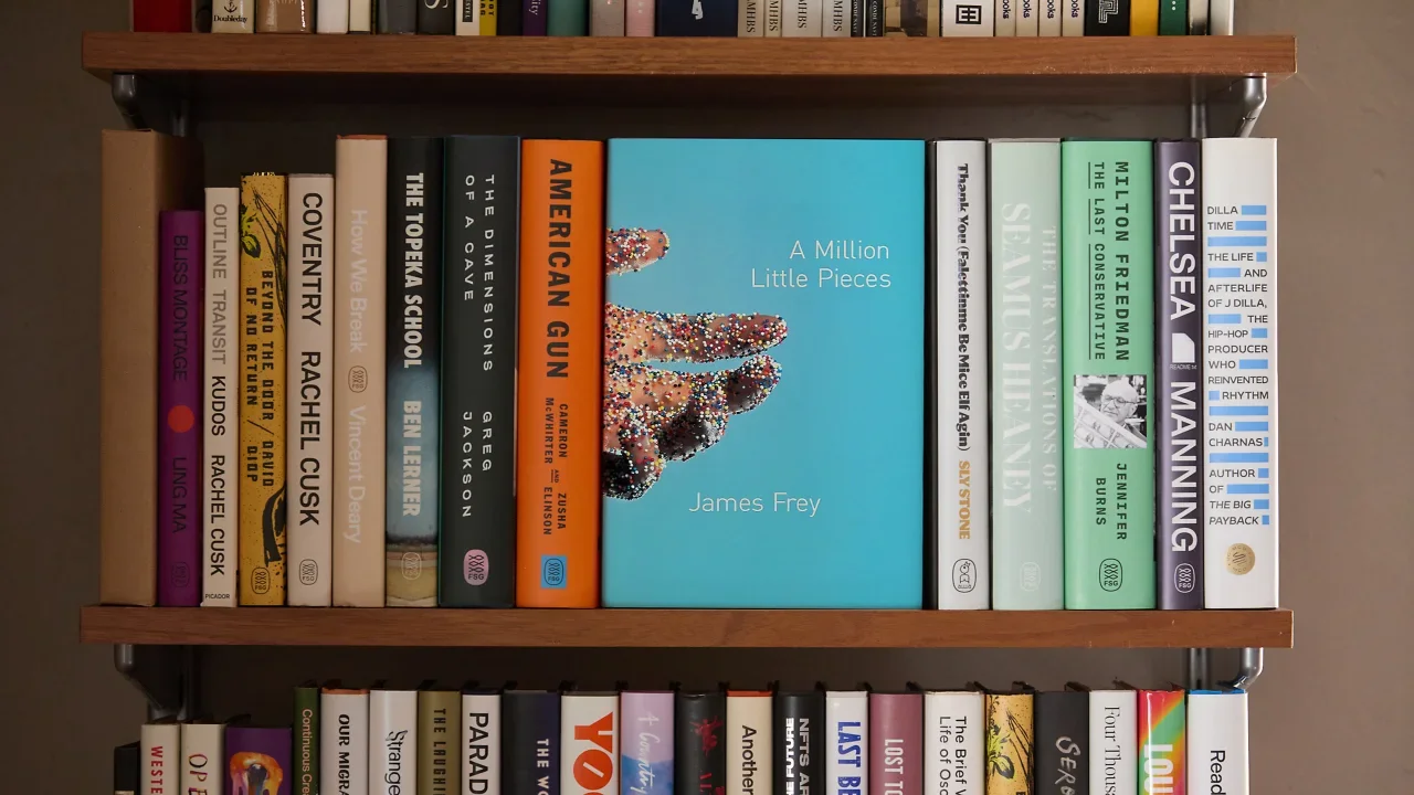
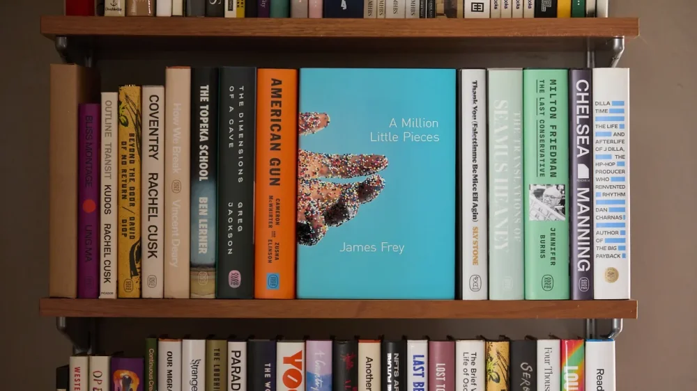
There’s one big thing about Rodrigo Corral that does not initially make sense: The book cover maestro does not have a signature style. Consider his chameleonic cover hits. The Fault in Our Stars. The Brief Wondrous Life of Oscar Wao. Survivor, Lullaby and the rest of Chuck Palahniuk’s catalog. Rachel Cusk’s books. James Frey’s controversial A Million Little Pieces, the cover that helped launch Corral into ubiquity. Recent collaborative output like Intermezzo and Mojave Ghost. The books don’t have obvious visual connective tissue between them—but somehow, as creative director of Farrar, Straus and Giroux and his eponymous studio, Corral has spent the past three decades quietly redefining the look of the modern book again and again. “A thing that we repeat often in the studio is, ‘Let’s be careful of what we’re good at, because it is the kind of work that you will attract,’” he says. Corral has heeded that caution throughout his career, avoiding pigeonholes and a life of designing the same jacket over and over—which is notable in a design subset often particularly driven by trends. Consider the Big Book Look of the ’60s, or the ubiquitous Book Cover Blob that seemingly seeped onto every jacket a few years ago. If a style has a proven track record, risk-averse publishers or marketing departments are quick to embrace it. Corral’s output, which often feels consistently contemporary, is novel for its sheer novelty. “Book covers usually follow trends,” Frey, one of Corral’s earliest clients, told me in an email exchange. “Someone makes a great one and everyone else copies it. If you care about such things, and I do, and try to find who made the original great one, it’s always Rodrigo.” GETTING WHAT YOU CAME FOR Corral was born and raised on Long Island, New York, the child of immigrants from Colombia. His parents ran a travel business together, not entirely unlike how he and his partner Anna Corral operate his personal studio today. Books didn’t play a huge role in his youth, but when he was around nine or 10, Corral’s parents bought him a set of Encyclopedia Britannica—and he savored their object quality. “I’d start cracking them open and appreciating the materials, the foil stamping, the faux leather,” he says, recalling how the anatomy section featured acetate layering for the nervous system and the muscular system. “Those are my closest earliest memories of a book experience.” After realizing design and art was a path he wanted to pursue, he applied to the School of Visual Arts, where he found himself studying under industry icons like Chip Kidd and Barbara deWilde. “They just always had a smile on their face,” he recalls. “And their work alone, it just had wit, it had charm, it had layers. And that really for me was like, ‘OK—I think I’d like to join the space, or at least try my hand at it.’” After leaving SVA, Corral got a job at Farrar, Straus and Giroux in 1996, where his first assignment was a paperback edition of Getting What You Came For: The Smart Student’s Guide to Earning a Master’s or a Ph.D. The book already had cover art, and he was disappointed that he didn’t get to infuse his own creativity into the project. Then he decided to make the best of it. The all-yellow cover featured a black-ink New Yorker-style illustration of a person hoisting a degree into the air. He made the diploma white to highlight its importance of, well, getting what you came for. It was a tiny victory, but perhaps an important early lesson in how one can infuse their perspective into an at-times rigid paradigm. On the whole, Corral loved his early days at FSG, especially because it was an environment where young designers got to sit in on meetings and where the publisher would walk the halls and greet everyone personally. Designers and their work were valued, which helps explain why it’s a house with a long history of fantastic cover output—from Joan Didion’s Slouching Towards Bethlehem (Lawrence Ratzkin) and Tom Wolfe’s The Right Stuff (Kiyoshi Kanai) to contemporary jackets like Jonathan Franzen’s Freedom (Charlotte Strick) and Tove Ditlevsen’s Copenhagen Trilogy (Na Kim). “Farrar, Straus and Giroux has always been a powerhouse literary publishing house that is editorially driven. And what that means from a design standpoint is we’re not reacting to what the markets are asking us,” Corral says. “It’s strong points of view with brilliant editors and a publisher at the helm [who] are reacting through fiction and nonfiction to what the world is telling us, in many ways. And so that all leads to supporting great design.” After five years at the company, Corral says there wasn’t much room for upward movement, so he left and did a stint at Grove Atlantic, followed by Doubleday. He was laid off in the post-9/11 publishing downsizing, but was given nine months severance—and that’s when he started Rodrigo Corral Design Studio. He opened it in the back of a friend’s production house, A2A Graphics, in Chelsea. And soon after he took on his first project: the cover for A Million Little Pieces. REDEFINING THE BESTSELLER But two decades on, you can probably instantly envision it—that outstretched hand, the kaleidoscopic candy dots, that hospital-hued background. Frey had no clue what Corral was going to turn in, but he did have high expectations for the cover to his addiction saga. With a background in art and art history, Frey had been sending Corral paintings of hell by old masters and related imagery. “Thankfully, he ignored them all and made his own cover,” Frey recalls. “When I saw it, I was initially taken aback. Visually, it’s very arresting, jarring. … It felt sharp, dangerous. It also felt lonely, and somehow broken. All of which were a reflection/representation of the text.” Frey, who also worked with Corral on his upcoming book Next to Heaven, says he didn’t respond for a day. He let his feelings settle. “And when they did, I was in love.” Corral came up with the idea on the way home from his studio. He would often walk past a particular confectionary shop. A package of candy dots in the window always jumped out at him, and as he was pondering Frey’s book, it clicked. He took his entire fee for the project and hired a photographer, and the two brought the cover to life. Ultimately, Corral says the publisher didn’t quite know what to make of it, and found it to be off-putting—but they said they couldn’t stop looking at it. It yielded a visceral reaction. “It cemented the tone for the kind of work we wanted to attract,” he says. “We wanted to do work that was not fitting nicely and neatly into a category and that did not necessarily fit the mold of what a bestseller must look like.” Catherine Casalino remembers the early days at Corral’s studio. She joined as an intern in 2003, and soon became full time. “Rodrigo has made a habit of swinging for the fences, and he encourages anyone who works at his studio to do the same. A big part of that is constantly seeking out fresh inspiration and collaborators,” she says. “In an age where you can easily marry up a stock image and a font to create an instant cover, or make a living by producing the same style of cover over and over, Rodrigo pushes back against that kind of process. You hire his studio not because you know what you’re going to get, but because you know they can deliver something special that you would never have imagined.” SOLVING THE BOOK While Corral may intentionally lack a signature style, he has a signature approach—and it yields work that can feel urgently relevant. When he’s designing, Corral starts with what he dubs “bad poetry”—he reads the manuscript and jots down quick notes in his phone. The ones that still resonate days or a week later are what he’ll start to focus on pushing forward. From there he concepts and designs. Sometimes he’ll start a cover and finish it completely. Other times in the studio he’ll have multiple people working on something. He likens the book design process to cinematography. To explain, he offers the concept of a book that has oranges as a theme. A cinematographer ponders, say, the temperature of the film, the color, whether it’s set primarily during day or night. “I find that parallel with book covers, where it’s typography, it’s scale, it’s composition, it’s lighting—and all those things can play into how that same orange can be very different on two different covers,” he says. Current Random House vice president, executive art director Greg Mollica joined Corral’s studio as a junior designer circa 2002/2003. “He’s a deep and close reader; he’d read manuscripts all day, bring them home and read them again at night, and come into the studio the next morning with ideas and brilliant singular ways to execute them,” Mollica recalls. “What struck me first about his studio and process was that the fine art, photography, fashion and culture books outweighed the traditional graphic design books in his personal collection. He was always devouring images and collecting art. Art was everywhere. Rodrigo thought like an artist—that’s what separated him in the cover design world.” In 2011, Corral rejoined FSG as creative director, and today that is officially his full-time job. “The decision to return felt strangely predetermined,” he says.“When I looked at the publishing landscape [publishers and imprints], I kept coming back to FSG as the place where I could contribute and feel valued as a visual artist.” He splits his time between New York City and California, and operates his independent studio—which works across all publishing houses for projects or as a creative director at large—after-hours. At FSG, he says he works with a team of experienced designers in a bit of an autonomous environment. On the studio side, he sees it as more of an agency model that utilizes Anna Corral’s background in branding and marketing in chorus with his creative direction. On the whole, “How we try to look at projects is we’re not solving to a style—we’re solving the book itself,” he says. Casalino would seemingly agree. “I think Rodrigo’s impact on modern book cover design is that he responds to the unique voices of modern literature in a way that truly reflects where modern literature is going,” she says. “I remember him saying that he got assigned Chuck Palahniuk initially because the writing was so unique that no one knew quite how to approach it. Instead of making those covers look like prior fiction, he reflected that unique language with a unique visual language.” BY A SHOW OF HANDS Those who have passed through Corral’s studio make up a remarkable roster. There’s Mollica. Casalino. June Park, Elena Giavaldi, Ben Wiseman, Liana Finck, Tyler Comrie, Jason Ramirez, Christopher Brand, Devin Washburn, and on and on. Today, he works with Adriana Tonello, Giacomo Girardi and a couple others. Corral won’t take credit for any of their careers or talent. But he does have an impressive track record of hiring wildly talented individuals wherever he oversees design—and that, perhaps, is his greatest contribution to publishing at large, beyond any single image. “If you hosted a book design event in NYC and you asked the audience by a show of hands who has mentored/worked with Rodrigo—over half the audience would raise their hands,” Mollica notes. “He’s mentored countless designers who are now exceptional art directors. The book cover industry would be completely different without Rodrigo’s influence. That is not an exaggeration. He’s our Paul Rand.” For his part, Corral says he’s always looking to surprise himself in his design work—and whether at FSG or his own studio, he is always seeking to help his teams surprise themselves, too. “I think Rodrigo’s work has encouraged more designers and publishers to push back against stereotypical cover design and rise to meet the incredible creativity that modern authors are producing,” says Casalino. Or, as Corral puts it—and likely put it years ago with that cover for A Million Little Pieces: “Hopefully we’ve delivered projects that can be genre-busting or genre-breaking, and that can become little victories for the future—for designers to say, Look, this book was successful with that jacket. Why can’t we as a house take that same leap?” What is Rodrigo Corral’s style? I don’t know. But if you spot a cover in a store that feels like it was designed and printed just moments before, there’s a good chance I could guess who art directed or made it. View the full article
-
‘The end of an era’View the full article
-
During his family’s annual summer vacations on North Carolina’s Outer Banks, high schooler Ajith Varikuti began to notice something concerning. Homes on the narrow line of barrier islands that Varikuti had grown up visiting from his hometown Charlotte were no longer there. “I started seeing more and more news articles about entire houses being completely destroyed. And it started clicking, because some of those houses that were being destroyed I’d seen in my previous years there,” he says. Varikuti, who was then a 9th grade student, knew there had to be a solution. So, as part of a student design competition organized by the design software company Autodesk, Varikuti put his mind to coming up with a design for a home that could better withstand the extreme conditions of the Outer Banks. (This year’s student design competition, Make it Home, is open until June 30 for students 13–21.) Ajith Varikuti His design is a modular, 3D printed home that sits on flood-resistant stilts and can be disassembled and moved if its site becomes untenable. The design was the grand prize winner in Autodesk’s 2024 Make it Resilient design competition, with a $10,000 prize. To create the design, Varikuti taught himself how to use computer-aided design, or CAD, software, starting with an entry-level educational version called Tinkercad before moving on to Revit, the industry-standard 3D design program used by architects and engineers around the world. Using online tutorials, he learned how to use the software to develop a structurally sound design that could be segmented into individual parts or modules. “I broke down each of the individual drawings into its own box, so that way you could build various combinations of houses with of the same set of modules,” he says. “I thought that was the most intuitive and allowed for the most freedom to design whatever house you wanted to.” The resilient home design was influenced by his own interest in engineering, and specifically 3D printing, which he’d begun exploring during the pandemic. Before even starting high school, he had designed and printed his own toy, a knight on a horse. That experience made him think that 3D printing parts of the house could be a viable way to make its individual modules, and allow them to be both assembled and disassembled. Varikuti’s resilient home design also accounts for the extreme conditions of the Outer Banks, using simulations within the software tools to test its capability to withstand hurricane-force winds. He even reached out to a structural engineer at the firm AECOM to fine-tune his design. “He pointed out various inefficiencies and inadequacies in my design,” Varikuti says. “I had too many pillars that were way too big originally.” This input also led him to redesign the footings for the house’s foundations so that they wouldn’t be affected by potential frost heaving. For a design created by a teenager, Varikuti’s is a surprisingly buildable concept, and one that could be a solution for the extreme conditions faced by the Outer Banks. There are currently no plans to get the house built, but Varikuti, who’s now in 10th grade, says the process of designing it has got him excited about creating projects that could get built one day. “This entire experience has made me realize how big of a world the engineering world is, and how there’s so many opportunities,” he says. “It’s led me to want to pursue a career in engineering, hopefully using CAD tools one day to make projects that will be implemented in real life.” View the full article