ResidentialBusiness
Administrators
-
Joined
-
Last visited
Everything posted by ResidentialBusiness
-
Sackings come as top adviser Mike Waltz faces pressure for discussing military strikes in Signal chatView the full article
-
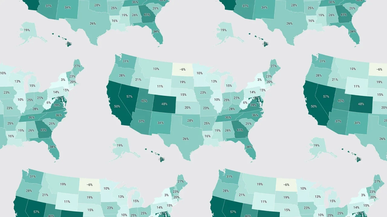
Want more housing market stories from Lance Lambert’s ResiClub in your inbox? Subscribe to the ResiClub newsletter. When assessing home price momentum, it’s important to monitor active listings and months of supply. If active listings start to rapidly increase as homes remain on the market for longer periods, it may indicate pricing softness or weakness. Conversely, a rapid decline in active listings could suggest a market that is heating up. Generally speaking, local housing markets where active inventory has returned to pre-pandemic levels have experienced softer home price growth (or outright price declines) over the past 30 months. Conversely, local housing markets where active inventory remains far below pre-pandemic levels have, generally speaking, experienced stronger home price growth over the past 30 months. How does housing inventory look in 2025? It looks like we will see a double-digit increase in active inventory this year across most of the country. National active listings are on the rise (up 28.5% between March 2024 and March 2025). This indicates that homebuyers have gained some leverage in many parts of the country over the past year. Some sellers markets have turned into balanced markets, and more balanced markets have turned into buyers markets. Nationally, we’re still below pre-pandemic 2019 inventory levels (20% below March 2019) and some resale markets, in particular big chunks of Midwest and Northeast, still remain tight to tight-ish. Here’s how the March 2025 inventory/active listings, compare to historical totals, according to Realtor.com: March 2017: 1,172,713 March 2018: 1,067,281 March 2019: 1,115,940 March 2020: 937,319 March 2021: 440,589 (overheating during the pandemic housing boom) March 2022: 354,016 (overheating during the pandemic housing boom) March 2023: 562,444 (mortgage rate shock) March 2024: 694,820 March 2025: 892,561 Below is the year-over-year percentage change by state. While active housing inventory is rising in most markets on a year-over-year basis, some markets still remain tight. As ResiClub has been documenting, both active resale and new homes for sale remain the most limited across huge swaths of the Midwest and Northeast. That’s likely where home sellers this spring will have more power. In contrast, active housing inventory for sale has neared or surpassed pre-pandemic 2019 levels in many parts of the Gulf region, including metro area housing markets such as Punta Gorda and Austin. These areas saw major price surges during the pandemic housing boom, with home prices getting stretched compared to local incomes. As pandemic-driven migration slowed and mortgage rates rose, markets like Tampa and Austin faced challenges, relying on local income levels to support frothy home prices. This softening trend is further compounded by an abundance of new home supply in the Sun Belt. Builders are often willing to lower prices or offer affordability incentives to maintain sales, which also has a cooling effect on the resale market. Some buyers, who would have previously considered existing homes, are now opting for new homes with more favorable deals. At the end of March 2025, seven states are above pre-pandemic 2019 active inventory levels: Arizona, Colorado, Florida, Idaho, Tennessee, Texas, and Utah. The District of Columbia is also above pre-pandemic 2019 inventory levels. (Weakness in D.C. proper predates the current admin’s job cuts.) The states that have jumped above pre-pandemic 2019 inventory levels are where home buyers have gained the most leverage heading into the spring 2025 housing market. Big picture: Over the past few years we’ve observed a softening across many housing markets as strained affordability tempers the fervor of a market that was unsustainably hot during the Pandemic Housing Boom. While home prices are falling in some areas around the Gulf, most regional housing markets are still seeing positive year-over-year home price growth. The big question going forward is whether active inventory and months of supply will continue to rise and cause more housing markets to see price softening? Below is another version of the table above—but this one includes every month since January 2017. If you’d like to further examine the monthly state inventory figures, use the interactive chart below. (You can also find more information here on the ongoing softness and weakness across Florida.) View the full article

-
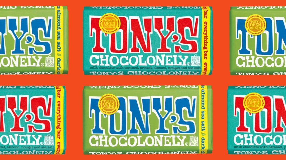
Another day, another recall: On Tuesday, popular chocolate brand Tony’s Chocolonely recalled two of its bars, Tony’s Dark Almond Sea Salt Bar (6.35oz) and Everything Bar (6.35oz), following 12 reports from consumers who found small stones “not filtered during third-party almond harvesting and the almond processing process.” The bars were distributed nationwide from February 7 to March 24, 2025 and sold in various retail stores, as well as at Tony’s online store. “We are extremely sorry to have to issue this recall, and for the inconvenience that this will cause,” a company spokesperson told Fast Company. “Whilst the probability of a product being affected is low, we always put the safety and satisfaction of our consumers first.” The company added that all complaints occurred outside of the United States and Canada, and no injuries or illnesses have been reported. Tony’s issued this voluntary recall in consultation with the Food and Drug Administration (FDA) as a precautionary measure. How can I tell if I purchased one of the recalled chocolate bars? The recall applies to seven lot codes, listed below: 6.35-oz. of of “Tony’s Chocolonely Everything Bar” with lot code 4327, UPC 850011828564, and use by date Nov. 22, 2025 6.35-oz. of of “Tony’s Chocolonely Everything Bar” with lot code 4330, UPC 850011828564, and use by date Nov. 25, 2025 6.35-oz. of of “Tony’s Chocolonely Everything Bar” with lot code 4331, UPC 850032676441, and use by date Nov. 26, 2025 6.35-oz. of of “Tony’s Chocolonely Everything Bar” with lot code M4331, UPC 850011828564, and use by date Nov. 26, 2025 6.35-oz. of of “Tony’s Chocolonely Dark Chocolate Almond Sea Salt” with lot code 163094, UPC 858010005641, and use by date April 2, 2026 6.35-oz. of of “Tony’s Chocolonely Dark Chocolate Almond Sea Salt” with lot code 162634, UPC 858010005641, and use by date Feb. 28, 2026 6.35-oz. of of “Tony’s Chocolonely Dark Chocolate Almond Sea Salt” with lot code M162634, UPC 850011828908, and use by date Feb. 28, 2026 No other Tony’s products are affected. What should I do if I have a recalled Tony’s chocolate bar? If you purchased one of the affected products with the specified lot codes, it is recommended to return it to the store of purchase for a refund, or throw it away. For more information, or to claim a refund or replacement, visit the company’s website here. View the full article
-
As someone who's planning to buy the Nintendo Switch 2, I've had my eye on the accessories I'd need to get with the console. Since Super Mario Party Jamboree, which is getting some new mini-games in its Switch 2 port, is one of the games I'm very interested in, the Switch 2 Camera accessory caught my eye. After all, who doesn't want to make dramatic faces while playing with their friends? You can even use it for chat, too. However, I'm not sure I can justify spending $50 on an accessory that'll probably gather dust after I'm done with Mario Party. Fortunately, it looks like the Switch 2 Camera is not the only way to play camera-based games or video chat with your friends on the Nintendo Switch 2. How to check if the Nintendo Switch 2 supports your USB-C camera Credit: Nintendo A quick look at Nintendo's Switch 2 Camera webpage reveals that you can use third-party USB-C cameras with the console, even ones that aren't made with it in mind. Like me, if you already have a USB-C camera lying around, you can plug it into the Switch 2 and the console will tell you if it's compatible. Whenever you end up getting the Switch 2, just go to the console's settings and navigate to the Controllers & Accessories section. Once the camera is connected to the Switch 2, select Test USB Camera and the console will let you know if the camera is compatible with the system. Why you might want to consider an alternative USB cameraI don't want to discourage people from buying Nintendo's Switch 2 Camera right away, since I haven't tried it yet. But I won't be buying it immediately, because it's too expensive for me. Yes, you get guaranteed compatibility and a useful stand that lets you place it on any flat surface, but that doesn't necessarily justify its price. At the time of writing, you can buy good USB-C webcams for as little as $20 each. These cameras ship with a privacy cover and adjustable stands that can be mounted on top of a TV or placed on a flat surface, and there's a good chance you already own one. If you can use one for the Switch 2 instead, it might be worth opting for that instead of spending extra cash. View the full article
-
Influencing has a major pay gap, and it’s not what you might expect. A new report from Collabstr, based on over 15,000 influencer collaborations using first-party data, reveals a surprising disparity: male creators earn 40% more per collaboration than female creators—$291 compared to $208 on average. This gap persists despite women making up the majority of the content creator space. In 2024, 72% of influencers are women, up from 70% in 2023. These two facts are connected. The report, which focused predominantly on nano and micro-influencers, suggests that female creators are paid less largely due to the sheer number of women in the industry. Oversaturation drives down rates and weakens their bargaining power compared to male counterparts. Notably, the report found that the higher the follower count, the smaller the pay gap. “While female dominated niches like fashion, beauty, lifestyle receive a lot of influencer spend, there is a lot of saturation especially at the nano and micro-influencer stage, and as a result the brands have more options and are able to price collaborations lower because there is essentially unlimited supply in these niches,” Collabstr cofounder Kyle Dulay tells Fast Company. Perception also plays a role in the gender pay gap. According to the report, women are more often labeled as “influencers,” while men are referred to as “content creators.” This distinction isn’t just semantic—it has real consequences. The label “influencer” can diminish and undervalue women’s work, framing them as product-pushers, while men are positioned as creative professionals and innovators. Dulay suggests that one way for female creators in saturated niches to command higher rates is by narrowing their focus. “Instead of being a ‘beauty’ influencer, see how you can narrow that down further, perhaps into skincare particularly or highlighting your journey with acne,” he explains. “By doing this, you’re no longer competing with every other female in the beauty space, and you retain the power to price your services accordingly, rather than having prices dictated by brands.” That niche doesn’t have to be permanent. “As you grow, naturally the ratio of female to male influencers drops, and you can begin widening your niche while retaining your pricing power,” he adds. The creator economy is booming. The user-generated content (UGC) market hit $7.62 billion in 2024 and is projected to climb to $35.44 billion by 2030. More creators are seizing the opportunity—66% now offer UGC services, up from just 26% in last year’s report. For female creators especially: know your worth, and don’t be afraid to claim it. View the full article
-
It's not difficult to delete an app off your iPhone. In fact, it only takes a few taps at most. If you're so inclined, you can even remove purchases from your Apple Account entirely. So it might come as a bit of a surprise if you see that app randomly reappear. As it happens, some users are seeing just that. MacRumors spotted multiple threads across both Reddit and Apple's Community Support site, all featuring the same complaint: users noticing apps they did not choose to download appearing on their iPhones. Some of these affected users had previously deleted these apps months or years ago, and didn't understand why they were back. Others, however, had no memory of ever downloading the app in question in the first place. The account Someandroiduser started a Community Support thread, claiming a previously deleted app "Last War Survival" ended up on their iPhone again. Redditor dURDENN7 posted the same, without naming the app in question. It's worth noting some of the commenters on that thread said their iPhones had downloaded "Last War Survival" as well, including one who said they had never downloaded the app before. Reddit user illyyas posted that they had discovered the game "Ingress" installed on their iPhone, despite the fact they don't play games at all on their phone. Another commenter said their iPhone downloaded "Cooking Mama" to their Home screen, even though the App Store still showed the option to "Get" the app—implying the user had never actually installed the app before. Another user shared a similar story with the game "Bit City." Is iOS 18.4 responsible?While it isn't totally clear what is behind these app downloads, one through line does appear to be iOS 18.4. The update officially dropped on Monday, adding new features and security patches for compatible iPhones. Unfortunately, Apple might've missed a bug in beta testing, since many of these user complaints note these apps mysteriously appeared after installing the latest iOS update. MacRumors notes that Automatic Downloads—the feature that installs previously downloaded apps on other connected Apple devices—doesn't seem to be at fault here, since many of the affected users only have iPhones. In addition, the outlet identified that these devices were not jailbroken and were not using a third-party app marketplace. To Apple's credit, this hasn't been my experience with the newest update. I installed iOS 18.4 on my iPhone, and, as far as I can tell, no new or previously downloaded apps found their way into my App Library. However, it is a problem: You shouldn't expect to see apps you previously deleted reappear on your device, and you definitely shouldn't see apps you never downloaded to begin with. Apple has not made a public statement about this issue, nor is there really much you can do to prevent it. If you happen to notice an app you previously deleted—or never actually downloaded in the first place—your best bet is to simple delete it, and hope it doesn't show up again. View the full article
-
Nations prepare offers to Washington including weapons deals, dropping their own tariffs and moves against ChinaView the full article
-
Paint is the cheapest, easiest renovation you can do: it makes everything fresh and new, it covers defects, and it’s something almost anyone can do to a reasonable level of quality. If you just read that last part and started shaking your head because your paint projects always turn out terribly—patchy, or with visible sheen or brush strokes, or a final color that doesn’t seem to match what you chose in the store at all—the cause probably isn’t your work ethic, or an evil spirit inhabiting your house. The problem probably lies in your prep work. If all you’re doing before you start slapping paint on the walls is applying some painter’s tape and covering the furniture, the chances that the final paint job will look terrible are actually pretty high. Here are all the things you should take into account before you dip that brush. Consider temperature and humidityThe weather can affect the quality of your paint job. Extreme temperature or humidity can have an adverse impact on the drying time. At colder temperatures, paint can thicken, extending its drying time. At hotter temperatures, it can dry too quickly, affecting adhesion. High humidity that leaves moisture on the walls will also result in a sub-par paint job. Your home is probably climate controlled, so painting inside even during extreme weather is certainly possible—just make sure the temperature is between 50 and 90 degrees and the humidity levels are between 40 and 60%. Prep the wallsIt’s usually a good idea to wash your walls before painting them to ensure there is no dust or dirt that could adversely affect adhesion. While you’re at it, look for cracks, dents, peeling tape, or other defects and patch everything up (including crayon or grease stains that will probably show through your paint unless they’re scrubbed off). A small flaw that isn’t noticeable now might become a glaring problem when a fresh coat of paint brings it to the forefront. Cleaning walls with a dry microfiber cloth followed by warm water and a sponge is usually sufficient, unless your walls are really dirty. If you’re worried about it, add a small amount of dish washing liquid or trisodium phosphate (if your walls are greasy and very dirty)—but avoid colored soaps that might leave a tint behind. Choose the right rollersOne big reason paint jobs look like crap? The nap on your roller cover. The nap of your roller describes the thickness of the fibers. Generally speaking, the smoother your wall surface is, the smaller the nap of your roller cover should be. Painting kitchen cabinets? Go with a 1/4-inch nap. Painting a brick wall? An inch or even a 1 1/4-inch nap is best. Smaller fibers pick up less paint, while thicker fibers hold more paint—a too-short nap can result in a patchy finish on rough surfaces, while a too-long nap can add unwanted texture to smooth surfaces. Most interior paint jobs will call for a nap between 3/8 inch (very smooth walls) and 3/4 inch (textured walls, like stucco). Apply a separate primer coatThese days you can buy paint and primer together, which is a terrific time saver. But if your walls aren’t in great shape, even after cleaning and patching, you will usually get a much better result with a separate primer coat. This step might not be 100% necessary on your walls, but taking the extra time to prime properly will guarantee the best possible outcome. Identify the paint's undertonesAlmost all paint has an undertone (its base color )and a masstone (its overall hue). The undertone can be subtle and difficult to suss out, which is why it’s so important to paint a few samples on the wall before you commit. The paint’s undertone will interact with everything else in the room in ways that aren’t always obvious in the store. You brought home a beige paint, for example, but it has a green undertone, and suddenly it looks all wrong on your walls because your wood floors have yellow undertones. You can ask about the paint’s undertone at the store where you’re buying it. You can also use a color wheel to compare it to primary colors to get a sense of the undertones involved. Combine multiple buckets of paintIf you’re painting a small room and using just one can of paint, you’re good to go. If your project is larger and you’ll be using multiple cans of the same color, you should combine all your paint into a larger bucket and mix it up—a process called “boxing.” This is a good idea because even if you bought your paint from the same store at the same time, there can be subtle variations between cans. Maybe the pigments dispersed incorrectly, or the mixing process was slightly off. Whatever the reason, even the tiniest variation between cans will be incredibly obvious when you switch to the new can. Boxing it eliminates the danger. Check out your window tintYour windows can throw a wrench into your paint colors. This is because many windows have a very subtle green tint due to the presence of iron oxide in the glass. This isn’t noticeable in any way to the naked eye, as a rule, but it can cast a greenish tint on your paint that’s just strong enough to make it look inexplicably wrong in the daylight. Putting samples on the wall to judge the color is a great idea—but make sure you paint those samples in a spot where the light from your windows will hit them. Samples that look perfect in a more shadowed area may suddenly look weird when light hits it through the window. Figure out the color temperature of your lightsAnother lighting issue is your light bulbs. All the bulbs you’re using in your light fixtures have a color temperature, and that can affect how your paint looks. Generally speaking, bulbs with higher color temperatures will brighten darker paint and mute lighter colors and vice versa. This means that a paint color that looks terrific in daylight can suddenly look grim or faded at night when the lights come on. It’s best to check your samples in all kinds of light to make sure you’ve chosen wisely—and change your bulbs to support your paint if necessary. You should also check the color rendering index (CRI) of your bulbs. This is a rating between 50 and 100 that indicates how accurate the color rendering of the bulb will be. A CRI of 90 to 100 will show your paint as accurately as possible, reducing the chances that it will look worse when the sun goes down. Load your roller upFinally, when actually painting, don’t be shy with your roller. When initially “loading” paint onto a dry cover, take your time and work paint deep into the nap. This can take a few minutes, so don’t rush—you want a nice, wet roller when you hit the wall. When painting, don’t roll until the roller is exhausted—reload frequently and keep the nap damp. Exhausting your roller will just leave streaks and faint spots that may or may not get covered by a second coat—and may or may not haunt you for years afterward. View the full article
-
United Wholesale Mortgage led its industry peers in total origination volume, though Rocket Mortgage and Crosscountry weren't that far behind. View the full article

-
TikTok is shutting down TikTok Notes—wait, you didn’t even know it existed? Well, that explains a lot. TikTok Notes, the platform’s short-lived attempt to take on Instagram (just as Instagram Reels was built to mimic TikTok), is officially being retired. Launched in limited markets like Canada, Australia, and Vietnam last year, the photo-sharing app let users post images with captions—simple enough, but apparently not compelling enough. Users are now being notified that TikTok Notes will shut down on May 8, with TikTok instead shifting focus to another ByteDance-owned platform: Lemon8. “We’re excited to bring the feedback from TikTok Notes to Lemon8 as we continue building a dedicated space for our community to share and experience photo content, designed to complement and enhance the TikTok experience,” a TikTok spokesperson said in a statement to TechCrunch. Lemon8—think Instagram meets Pinterest—has quietly been gaining traction, tripling its U.S. user base since last summer and hitting 12 million downloads. It reportedly had around 12.5 million global monthly active users by December 2024. TikTok didn’t spell out why Notes is getting the axe, but given how few people knew about it . . . the writing was on the wall. In a notice to users, TikTok is urging anyone who used Notes to download and save their content before the app disappears for good. They’re also encouraging creators to continue their “creative journey” on Lemon8 instead. Unlike TikTok’s vertical video scroll, Lemon8 leans photo-first, allowing users to post curated carousels and slideshows. Still, it borrows TikTok’s dual-feed format, with both a “Following” and “For You” feed for discovery. Déjà vu? That’s because TikTok already started plugging Lemon8 as a backup late last year when a potential U.S. ban first loomed. Now, with a fresh April 5 deadline hanging over TikTok’s head, the strategy looks familiar—and unchanged. The short lesson of TikTok Notes: if it ain’t broke, don’t fix it. And if the whole app banned, I guess everyone panic. View the full article

-
Exporters from cars to whisky hit, while economists warn of growth impact View the full article
-
Private lenders are looking for ways to expand their reach as their traditional market has become crowded, and nonconforming mortgage lending is an answer. View the full article

-
Mortgage rates remain in the 6.6% range, with the tariff news so far having little impact, but could change given the 35 basis point drop in the 10-year yield. View the full article

-
We may earn a commission from links on this page. Garmin unveiled a subscription tier for its app last week featuring an AI that promises to provide insights on your training. I liked the company’s policies around training and privacy, but hadn’t seen much of the actual AI output when I wrote about it. Now, I’ve spent a week with the feature, which Garmin says is still in beta. Here are my impressions. The AI insights are just one of the features that rolled out with the new $6.99/month Garmin Connect+ subscription. Some of the other add-ons look a lot more useful, like the Live Activities feature. I have a full rundown here on what you get if you pay for the upgrade. The subscription only covers new features—not existing app features, and not specific features that come with the watch you buy. AI insights only appear in one limited part of the appI’ve been poking everywhere in the Garmin Connect app, and I can only find AI insights in one place. That would be the home screen, where I get a little “active intelligence” paragraph right at the top, above my usual workout and health metric cards. If you don’t check your Garmin Connect app frequently, you’ll miss out on most of the insights. They don’t pop up on your watch or in notifications on your phone. There’s no chat interface like with Whoop or Oura, where you can ask questions about your data. I expected the AI to be more like Strava’s, where a little description/motivational message appears on each activity you do. Strava’s AI is notorious for restating the data from the run description, with added errors, though, so perhaps it’s best they didn’t try to mimic that. Credit: Beth Skwarecki The AI "insights" aren’t very insightfulMy first few insights were pretty basic—just comparing my intensity minutes to a goal that I didn’t realize I had—but I figured more interesting analysis was yet to come. After a week, though, I haven’t seen it. The most exciting moment was when I caught the AI in a flagrant math error. “You logged two activities today: running and indoor cycling for a total of one hour and twenty-seven minutes,” it said. My activities were noted in their usual place, immediately below this “insight,” and the run was 40:10 while the bike ride was a quick test of this gadget that took less than three minutes. That’s 43 minutes, silly robot. (I'm not the only one who has encountered some bad math: Two scuba divers posted on Reddit that the AI told them they spent more than a month underwater in a single day.) The AI’s obsession with intensity minutes may be to blame in my case. I can’t make the math work out for this example, but in some other cases, the AI seemed to be adding up intensity minutes and not always including the word “intensity.” (One minute of vigorous exercise counts for two “intensity minutes,” an idea that comes from public health exercise guidelines.) Otherwise, the messages were just basic summaries of data that was already viewable elsewhere in the app. I did my best to screenshot every insight I saw, and here’s the tally of topics: 5 messages about intensity minutes, either comparing them to my goal or weekly or daily averages 3 messages about my stress level or “sleep stress,” a metric I’d never heard of and still can’t figure out what it means 2 messages about my Body Battery (a number that goes up with sleep and down with exercise or stress) 2 messages about steps 2 messages about run activities (with my mileage, pace, and/or time) 2 messages about bike activities (with my time, heart rate, cadence, and/or power) 1 message about my training status being in “recovery” After a sentence or two with the metrics it’s describing, there would be a sentence generically encouraging me to keep up the good work. I could give feedback as to whether the insight was interesting or not, but there was no way to ask questions or get more information. I still don’t know what “sleep stress” is, or how to get a quick overview of my intensity minutes if I did want to keep track of them. It doesn’t seem like anyone is enjoying the AI featureI’m always the wet blanket on AI hype, so I checked Reddit and Garmin forums to see if anybody is having a better time with it than I am. I couldn’t find anyone who admitted to liking Active Intelligence or gleaning any useful insights from it. “There is so much that could be done with AI and training software, but all Garmin does is using AI to simply rephrase existing data,” a Garmin forum user said. “Seems like 'Active Intelligence' is basically just the most basic summary of your workouts possible,” said a redditor, adding, “I was really hoping that it would be an actual chatbot that you could discuss training with etc to create plans.” Other redditors wondered why the AI doesn’t create or adjust training plans, possibly even analyzing users’ data to find which workouts tend to correlate with fitness increases. Garmin hasn’t publicly said what future plans they have for AI, just that the feature is currently in beta. “I received messages from AI throughout the day and I can say that they have no practical or informational benefit for me,” one redditor said. I’m afraid I have to agree. View the full article
-
Beijing denounces ‘biased’ move by rating agency, insisting country’s economic foundations are stableView the full article
-
The underlying prime mortgages have an average balance of $358,024, a weighted average (WA) original FICO score of 776, an original cumulative loan-to-value (LTV) ratio of 73.6%. View the full article

-
Component facilities in Michigan and Indiana are hit after carmaker idles production in Canada and Mexico View the full article
-
We may earn a commission from links on this page. Deal pricing and availability subject to change after time of publication. There have been many earbuds with great active noise canceling (ANC) over the years, but none have reached the standard set in 2023 by the Bose QuietComfort Ultra. They are still the best ANC earbuds you can get in 2025. Right now, you can get the Moonstone Blue for $219.99 (originally $299) on Amazon, matching the lowest price they've been, according to price-tracking tools. You can also get the Diamond 60th Anniversary Edition for $229. Brand: Bose, Color: Moonstone Blue, Ear Placement: In Ear, Noise Control: Active Noise Cancellation Bose QuietComfort Ultra Wireless Earbuds $219.99 at Amazon /images/amazon-prime.svg $299.00 Save $79.01 Get Deal Get Deal $219.99 at Amazon /images/amazon-prime.svg $299.00 Save $79.01 Brand: Bose, Color: Diamond, Ear Placement: In Ear, Noise Control: Active Noise Cancellation Bose QuietComfort Ultra Bluetooth Earbuds $229.00 at Amazon /images/amazon-prime.svg $299.00 Save $70.00 Get Deal Get Deal $229.00 at Amazon /images/amazon-prime.svg $299.00 Save $70.00 SEE -1 MORE Bose QuietComfort Ultra Bluetooth Earbuds $219.99 at Amazon $299.00 Save $79.01 Get Deal Get Deal $219.99 at Amazon $299.00 Save $79.01 The Bose QuietComfort Ultra Bluetooth earbuds received an "outstanding" review from PCMag, not just for their best-in-class ANC, but also for their great audio, Active Aware feature, Spatial audio support, and diverse codec Bluetooth support with AAC and AptX, which makes them great for Android and Apple users alike. However, they're not perfect. They lack multipoint connectivity, which other high-end earbuds at this price point offer, and there is no wireless charging for the case (if you care about that). The features are what sets these earbuds apart. They have a CustomTune feature that measures your ear's canal's shape to tune the sound and establishes your best ANC profile. You can adapt changes in the companion app as well. Bose calls its spatial audio feature "Immersive Audio," which is a feature that mimics hearing your surroundings similarly to what it would feel to wear open-ear headphones. You can also mess around with the settings to mix and match outside noise and ANC within the Immersive Audio setting on the app. You'll get about four to six hours of battery life and another 12 to 18 with the battery case. The earbuds aren't waterproof, but they are water resistant with an IPX4 rating, so you can wear them in the gym. View the full article
-
Islands’ exports to US — a category composed almost entirely of a succulent deep-sea fish — will face 42 per cent levy from next weekView the full article
-
The Panama Canal is one of the most important waterways in the world, with about 7% of global trade passing through. It also relies heavily on rainfall. Without enough freshwater flowing in, the canal’s locks can’t raise and lower ships traveling between the Atlantic and Pacific oceans. Droughts mean fewer ships per day, and that can quickly affect Panama’s finances and economies around the world. But the same freshwater is also essential for Panama’s many other needs, including drinking water for about two million Panamanians, use by Indigenous people and farmers in the watershed, as well as hydropower. When the region experiences droughts, as it did in 2023–2024, the resulting water shortages can lead to increasing water conflicts. One of those conflicts involves a new dam the Panama Canal Authority plans to begin building in 2027. It would be designed to secure enough water to keep the canal, which contributes about 4.2% to the country’s gross domestic product, operating into the future, but it would also submerge farming communities and displace over 2,000 people from their homes. This recent drought wasn’t an anomaly. As an academic who studies the effects of rising temperatures on water availability and sea level rise, I’m aware that as the climate warms, Panama will likely face more extremes, both long dry spells and also periods of too much rain. That will force more trade-offs between residential needs and the canal over water use. Complex engineering remade the landscape The Panama Canal was built over a century ago at the narrowest point of the country and in the heart of its population center. The route was historically used by the Spanish colonies and later for a rail line between the oceans. The idea of a canal connecting the Atlantic and Pacific oceans began as a French endeavor, led by architect Ferdinand D. Lesseps, designer of the Suez Canal in Egypt. After the French effort failed, the U.S. government signed a treaty with newly independent Panama in 1903 to take over the project. The U.S. acquired the rights to build and operate the Panama Canal in exchange for U.S.$10 million and annual payments of $250,000. Later, the Torrijos-Carter Treaty in 1977 committed the U.S. to transfer the control of operations to Panama at the end of 1999. The canal project was designed to take advantage of the region’s tropical climate and abundant average rainfall. It harnessed the water of the Chagres River basin to run three sets of locks—chambers that, filled with fresh water, act like elevators, lifting or lowering ships to compensate for the difference in water levels between the two oceans. To ensure enough water would be available for the locks, the canal’s designers changed the shapes of the region’s mountains and rivers to create a large watershed—over 1,325 square miles (3,435 square kilometers)—that drains toward the canal’s human-made lakes, Gatun and Alajuela. About 65% of the water that flows from the watershed today goes to operate the locks. The majority of that water is quickly lost to the oceans. Even the two newest locks, built in 2016, only reuse about 60% of water on each transit—40% is flushed to avoid saltwater from the oceans intruding into the watershed. Threats to water security Panama’s wet tropical weather is predominantly influenced by its location near the equator, the trade winds, and the oceans. Most of its rain falls during the wet season, from May to November. However, weather records show a drop in average precipitation starting around 1950. The driest years resulted in dangerously low water levels in Gatun Lake that made canal operations difficult, including in 1998, 2016 and most recently 2023-2024. El Niño weather patterns can mean particularly low rainfall. In December 2023, the Panama Canal Authority was forced to limit the number of daily transits to 22, compared with 36 to 38 usual crossings, because too little freshwater was available. To avoid steep financial losses, the Panama Canal Authority raised prices and auctioned transit opportunities to the highest bidders. Without those measures, the authority estimated it would lose $100 million a month from reduced ship traffic because of the water shortage. Ecosystems also need enough water, and changes in forest tree composition have become evident on Barro Colorado Island in Gatun Lake in response to rising temperatures and more frequent droughts. Climate change is also creating greater variability in rainfall. Too much rain can also be a problem for canal operations. In December 2010, the biggest storm on record caused landslides and $150 million in damage that interrupted transits on the canal. Sustaining Panama’s canal and its people Temporary measures for saving water have been already implemented. The Panama Canal Authority shortened the chamber size in some of its locks to use less water for smaller vessels and minimized direction changes. In January 2025, the authority approved plans to build the new dam on the Indio River to increase water available for the canal. The dam could solve some water concerns during drier periods for the canal. However, it also illustrates the country’s water conflicts. Once filled, the dam’s reservoir will submerge over 1,200 homes by some counts, and more people in the region will lose access to land and travel routes. The Panama Canal Authority promises that residents will be relocated, but some of those living in the region fear they will lose their livelihoods, along with the communities their families have lived in for generations. Residents across Panama, meanwhile, regularly hear media campaigns that encourage them to save water. An Environmental Economic Incentives Program promotes forest conservation and sustainable family agriculture to conserve water resources. The Panama Canal is a crucial part of international trade, and it will face more periods of water stress. I believe responding to those future changes, as well as market and societal demands, will require innovative solutions that respect ecosystem limits and the needs of the population. Karina Garcia is a researcher and lecturer in climate at Universidad Tecnológica de Panamá. This article is republished from The Conversation under a Creative Commons license. Read the original article. View the full article

-
Google is planning a new update for its upcoming Pixel 9a which includes a new feature dedicated to protecting and prolonging the phone's battery. While the goal is longevity, this new battery management feature will actually end up reducing the battery capacity of the Pixel 9a over time. It won't just be the Pixel 9a, as other Pixel series phones will eventually receive the feature too. The kicker, though, is Pixel 9a users can't turn this feature off. Why do Lithium-ion batteries need management?All lithium-ion batteries degrade over time. As you use your smartphone, and as you continue to charge it, the total battery capacity goes down. Eventually, charging your phone to 100% doesn't last as long as it used to: maybe 100% battery today really gets you 80% of the battery capacity of the battery when it was new. Manufacturers have introduced workarounds that help prolong the inevitable, by limiting how much you actually charge the battery. Apple has an iPhone feature that lets users limit the battery charging between 80% and 95%. There are apps that do this for the Mac as well. These measures do go a long way in prolonging the battery of a device. In the short term, you might not notice any difference, but these changes can lead to batteries lasting for months or years longer than they used to. Now that Google is supporting Pixel devices with seven years of software updates, it's in the company's interest to ensure its devices' batteries are performing at a level that can support the new software and features that will be added in the years to come. How Google's Battery Health Assistance worksAs first reported by 9to5Google, Google is adding a new "Battery Health Assistance" feature to Pixel phones, starting with the Pixel 9a. Google is taking quite a different path than Apple here: Instead of providing an option to limit battery charging overnight, or to a particular percentage, Google will start to reduce the battery's maximum voltage after the Pixel 9a crosses 200 charge cycles. A charging cycle doesn't mean a single charging session. It means charging your phone from zero to 100%, even if that happens in breaks, over multiple days. If your phone drops from 100% to 60%, then you charge it to 100% again, that's 40% of a full charge cycle. If you then let it fall to 40%, and charge it back up to 100%, that's 60% of cycle—combined, that's one full cycle. So, once the system clocks 200 of those cycles, Battery Health Assistance kicks in. Google will do this automatically and in the background, hopefully without being too intrusive. Google says that users may notice small decreases in the battery's runtime as the battery ages, and will continue to reduce voltage for up to 1,000 charging cycles. Once this feature rolls out to existing Pixel devices, you will be able to turn it off if you prefer—with one exception. Mandatory Battery Health AssistanceAs I mentioned above, the Pixel 9a is currently the only Google smartphone that won't have an off switch for Battery Health Assistance. While this is a good feature, and it will prolong the battery life of the smartphone, not having the option to turn it off, and thus having no choice in whether to use the full charging capacity of the phone, is a bummer. Since the Pixel 9a has the biggest battery ever in a Pixel phone (5,100 mAh), your phone's battery should be in good shape for a while. But the fact that Google is forcing this feature onto its users, and not presenting it as a choice, will likely rub Pixel 9a users the wrong way—especially since other Pixel users will have a choice in the matter. At the time of writing I don't know how this feature will work, how it will be turned off, but I suspect that will go hand in hand with the upcoming Android 16's new Battery Health section that lets users limit charging capacity to 80%, shows battery cycle count, among other battery related data. This, along with the fact that the Pixel 9a will miss out on the top-tier AI features, differentiates it from the Pixel 9 (which can be found as low as $600 on sale). Perhaps the latter is the phone to go with for users who want as much control over their device as possible. View the full article
-
Welcome to AI Decoded, Fast Company’s weekly newsletter that breaks down the most important news in the world of AI. You can sign up to receive this newsletter every week here. OpenAI says it will release an open-source model–but why now? OpenAI CEO Sam Altman said Monday that his company intends to release a “powerful new open-weight language model with reasoning” in the next few months. That would mark a major shift for a company that has kept its models proprietary and secret since 2019. The announcement wasn’t a total surprise: After the groundbreaking Chinese open-source model DeepSeek-R1 showed up in January, Altman said during a Reddit AMA that he realized his company was “on the wrong side of history” and suggested an OpenAI open-source model was a real possibility. Open models typically come with a permissive license that requires little or no payment to the model developer. Open-weight models can be more cost-effective for corporations trying to leverage AI since they allow businesses to host (and secure) the models themselves—avoiding the often risky prospect of sending proprietary data through an API to a third-party provider and paying fees to do it. More businesses are moving in this direction—especially those holding sensitive user data in regulated industries. The catch: A corporate user doesn’t have to pay to use the open model. Some AI labs release open models to gain credibility in the market—potentially paving the way to eventually sell API access to their more powerful closed models. By releasing open models early on, the French AI company Mistral established itself as a top-tier AI lab and a legitimate alternative to U.S. players. Some AI labs release open-source models, then earn consulting fees by helping large enterprises deploy and optimize the models over time. Meta’s Llama models are the most widely deployed “open” models—though the company restricts reuse and redistribution and keeps the training data and code secret, meaning they are not by definition open source. Meta had different reasons for giving away its models. Unlike Mistral and others, it makes money by surveilling users and targeting ads—not by renting out AI models. Zuckerberg continues funding Llama research because the models are a disruptive force in the industry and earn Meta the right to be called an “AI company.” OpenAI now has its own reasons for releasing an open-weight model. Eighteen months ago, OpenAI was the undisputed champion of state-of-the-art AI models. But in the time since, the release of LLMs like Google’s formidable Gemini 2.0 and DeepSeek’s open-source R1 have cracked the competition wide open. The market has changed, and OpenAI itself has evolved. Like Meta, OpenAI doesn’t depend directly and solely on its models for its revenue. Selling access to its models via an API is no longer the company’s main source of revenue. Now, most of its revenue, not to mention its staggering $300 billion valuation, comes from selling subscriptions to ChatGPT (most of them to individual consumers). OpenAI’s real superpower is being a household-name consumer AI brand. OpenAI will definitely continue pouring massive resources into developing ever-better models, but its main reason for doing so isn’t to collect rent from developers for direct access to them, but rather to continue making ChatGPT smarter for consumers. AI video generation is getting scary good AI-video-generation tools are rapidly leaping over the uncanny valley, making it increasingly difficult for everyday internet users to distinguish between real and generated video. This could bode well for smaller companies looking to produce glossy, creative, or ambitious ads at a fraction of the normal cost. But it could spell bad news if bad actors use the technology in phishing scams or to spread disinformation. It’s also yet another threat to the film sector’s livelihood. The issue is back in the spotlight following several announcements, starting with Runway’s release of its new Gen-4 video-generation system, which the company says produces “production ready” video. AI startup Runway says the new system of models understands “much of the world’s physics” (a claim supported by this video of a man being overtaken by an ocean wave). The company also touts improvements in video consistency and realism, as well as user control during the generation process. Runway posted a demo video of Gen-4’s control tools, which makes the production process look pretty easy, even for non-technicals). Some of the samples of finished videos posted on X look somehow more real than real (see Jean Baudrillard, Simulacra and Simulation). Runway faces some stiff competition in the AI video space in the form of perennial contenders including Google’s Veo 2 model, OpenAI’s Sora, Adobe Firefly, Pika, and Kling. A new math benchmark aims to beat test question “contamination” People in the AI community have been debating for some time whether our current methods of testing models’ math skills are broken. The concern is that while existing math benchmarks contain some very hard problems, those problems (and their solutions) tend to get published online pretty quickly. This of course makes the problem-solution sets fair game for AI companies sweeping up training data for their next models. The worry is that, come evaluation time, the models may have already encountered the test problems and answers in their training data. A new benchmark called MathArena was designed to eliminate those issues. MathArena takes its math problems from very recent math competitions and Olympiads, which have obvious incentives to keep their problems secret. The researchers from MathArena also created their own standard method of administering the evaluation, meaning the AI model developers can’t give their own models an edge via changes to the evaluation setup. MathArena has just released the results of the most recent benchmark, which includes questions from the 2025 USA Math Olympiad. Here’s one of the questions: “Let H be the orthocenter of the acute triangle ABC, let F be the foot of the altitude from C to AB, and let P be the reflection of H across BC. Suppose that the circumcircle of triangle AFP intersects line BC at two distinct points, X and Y. Prove that C is the midpoint of XY.” Ouch. And to make matters worse, the test requires not only the correct answer but a description of each reasoning step the model took along the way. The results are, well, ugly. Some of the most powerful and celebrated models in the world took the test, and none scored above 5%. The top score went to DeepSeek’s R1 model, which earned a 4.76%. Google’s Gemini 2.0 Flash Thinking model scored 4.17%. Anthropic’s Claude 3.7 Sonnet (Thinking) scored 3.65%. OpenAI’s most recent thinking model, o3 mini, scored 2.08%. The results suggest one of several possibilities: Maybe MathArena contains far harder questions than other benchmarks, or LLMs aren’t great at explaining their reasoning steps, or earlier math benchmark scores are questionable because the LLMs had already seen the answers. Looks like LLMs still have some homework to do. More AI coverage from Fast Company: An AI watchdog accused OpenAI of using copyrighted books without permission Amazon unveils Nova Act, an AI agent that can shop for you What is AI thinking? Anthropic researchers are starting to figure it out How Hebbia is building AI for in-depth research Want exclusive reporting and trend analysis on technology, business innovation, future of work, and design? Sign up for Fast Company Premium. View the full article

-
UK chancellor Rachel Reeves dismissed idea of launching tax later in bid to ‘maximise revenue’, Treasury documents revealView the full article
-
UWM, embroiled in an us-or-them feud when it comes to business partners working with Rocket, terminated its subservicing and sales deals with Mr. Cooper. View the full article

-
One of the world’s most iconic and controversial maps just got a major redesign. The Metropolitan Transportation Authority (MTA) in New York has unveiled the final version of an updated map of its subway system, marking the first time the map has had a full redesign since 1979. It’s a visually bold, user-centric design that, according to the MTA, will make it easier for people to understand where they’re going and how to use the system. The new maps are expected to be installed in train cars and stations over the next few weeks. The map features bright, color-coded lines for each train line, which criss-cross a stylized map of the city in horizontal, vertical, and diagonal orientations. More abstract than the previous geographically representative map, the new map prioritizes visual clarity and accessible design over pure accuracy. With single-lined black text on a largely white background and black dots representing stations on bright colored route lines, the new map was designed to be easily read by people with varying levels of vision and color perception. “Our approach was to make this map inclusive to all,” said MTA chief customer officer Shanifah Rieara at a recent press conference unveiling the new design. A big part of the inclusivity is managed by simplifying the geography of the map, using abstracted forms to represent the boroughs and straight lines to represent subway routes that are in fact much more sinuous. It’s an approach that was unveiled in the now-famous 1972 subway map designed by Massimo Vignelli and the design firm Unimark International. It was a minimalist design that became a source of controversy, and one literal debate. In 1978, Vignelli was pitted on stage against John Tauranac, then chair of the MTA’s Subway Map committee, who wanted the system to have a more geographically representative map. Tauranac’s approach won out, and the so-called spaghetti version of the map with winding routes and geographically accurate depictions became the map that has been used from 1979 until now. Though the printed map is being put into service as of this week, this design was first piloted back in 2021, and builds on Work & Co’s live, interactive digital map of the system that has a similar Vignelli-inspired aesthetic. When the pilot design was first launched, an MTA official told Fast Company a final version of the map was expected within months. Four years later, the printed maps are finished. Part of the long gestation has to do with the way the MTA vetted the design, conducting rider surveys to learn more about how people use the map, and the ways some maps make using the system more difficult. Based on this feedback, the map’s design evolved. The biggest changes relate to some of the most challenging parts of riding a complicated, multi-lined subway system: the transfer. Steven Flamm, manager of mapping for MTA’s Creative Services department, says the map’s design was tweaked to improve the way the map visually explains how to transfer train lines, whether on the other side of a platform, through a tunnel, or across a street. “You’ll see a different treatment for hubs and complexes that make it more obvious, so people know they can get their trains in that station,” says Flamm. The MTA sees the new map as a mix of the Vignelli design’s minimalist simplicity and a more geographically accurate approach from the Tauranac version that helps people to navigate the system more easily. Design-minded riders may see more of the Vignelli in this new map, but that doesn’t mean the Tauranac version in use for the last four decades has disappeared, according to MTA chair and CEO Janno Lieber. “The real superfans out there will recognize the colors that were established in the famous Tauranac map,” he said. View the full article