All Activity
- Past hour
-
OpenAI is expanding ChatGPT Ads and launching self-serve access. Here’s what PPC managers should know before deciding whether it deserves real budget. The post ChatGPT Ads: New Acquisition Channel Or Just Another Brand Tax? appeared first on Search Engine Journal. View the full article
-
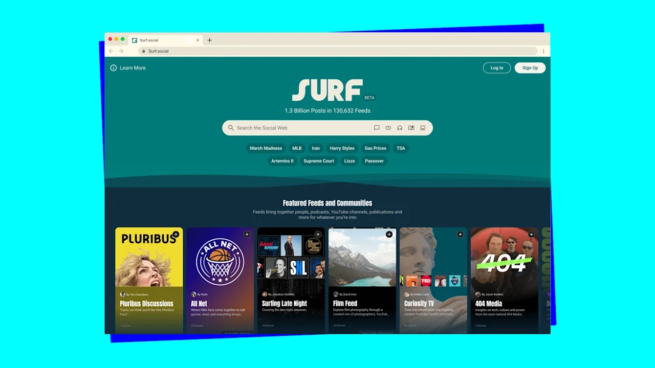
Hello again, and welcome back to Fast Company’s Plugged In. More than 15 months ago, I wrote about Surf, a discovery engine for the social web from Flipboard—itself an earlier twist on the same concept dating to the early days of the iPad. At the time, it was still a rough draft, and in private beta. Rather than rushing it out to a broader audience, Flipboard took its time. The app went through a series of revisions that were both numerous and substantial, ending up significantly different than the intriguing prototype I tried in December 2024. This week, the company finally deemed Surf ready for prime time. It’s now live in web form at Surf.social; a beta Android version is in the Google Play store. (The iPhone and iPad versions still have a waitlist.) If you’ve grown jaded about social networking or the web in general, I recommend taking a look. Surf’s sheer ambition makes it a challenge to describe coherently. It weaves together material from Bluesky, Mastodon, and Threads—along with YouTube videos, podcasts, blog posts, and articles—and yet it isn’t really a substitute for those services’ own apps. It’s a way to create and share custom feeds about your interests that run on autopilot once you’ve set them up, but that’s optional—you can also just lurk and peruse other people’s feeds. And even though it runs inside a web browser, it feels a little like what browsers themselves might have become if they hadn’t largely stopped evolving almost 20 years ago. All I know for sure is that using Surf leaves me feeling better about the state of the internet. I am aware that the net is rapidly filling up with AI-generated slop, and that, furthermore, the technology’s impact on search and advertising threatens to disincentivize humans from bothering with the medium at all. But for now, there’s still lots of great stuff out there—and Surf is a refreshingly inventive way to find it. It would be inaccurate to describe Surf as an algorithm-free zone. Like Flipboard before it, it uses computer science to help identify what individual pieces of content are about so they can be woven together thematically. Unlike Facebook or TikTok, however, it isn’t a giant machine designed, above all, to keep you scrolling. Flipboard worked with individuals and outlets such as The Verge, 404 Media, and Rolling Stone to ensure that the app launched with a bevy of feeds worth following. The result feels curated, not stuffed to capacity. Even though Surf is decidedly human, it’s organized around interests and passions, not friendships or followers. It’s possible to skim individual Bluesky and Mastodon accounts, but that’s secondary to subscribing to topic-based feeds. Not surprisingly, politics and current events are available in great supply. But so are quieter pursuits that can get drowned out in the din of social networking in its more conventional form: books, cooking, hobbies, and fandoms of all kinds. The other thing about Surf that it has in common with Flipboard—and darn few other ways to consume digital content—is that it tries to present everything to its best advantage. Much of the rest of the field has a stunted feel, as if the highest possible aspiration was to rekindle the aesthetic of early Twitter. Surf, by contrast, complements its Posts tab with ones called Watch, Read, Listen, and Look, each optimized for a different sort of media. In Look, for example, photos are so downright expansive that they make the ones in other social apps look like postage stamps. Surf lets you sign in with your Bluesky and/or Mastodon accounts, allowing you to comment, like, and share on those networks. Some of its feeds are set up as communities unto themselves, letting you post items with a hashtag to pipe them into the flow. Overall, though, it has a magazine-y vibe that’s conducive to leaning back and enjoying what other people are sharing. If all those Twitter-style apps have the spirit of talk radio, this one feels more like a Sunday newspaper. Even after well over a year of incubation, Surf is clearly a first pass at a bigger idea. I occasionally found the way it intermingles multiple social networks befuddling, especially when I was thinking about liking or sharing something and couldn’t quite tell if that involved Bluesky or Mastodon. The long-term goal, Flipboard CEO Mike McCue told me recently, is not only to make that cross-pollination smoother, but to render it irrelevant for many users. “Some people have a Bluesky account, some people have a Mastodon account, some people don’t have either of those,” he explained. “In fact, most people don’t even know what those things are. So what we want to do is make it all about the community, not about joining the social web.” Participating in Surf, McCue said, should be as easy as joining Substack and easier than joining Discord, regardless of where items of interest originated. Given the temptation to give in to dark thoughts about where the internet is headed, I am excited to see where this bright spot could take us. You’ve been reading Plugged In, Fast Company’s weekly tech newsletter from me, global technology editor Harry McCracken. If a friend or colleague forwarded this edition to you—or if you’re reading it on fastcompany.com—you can check out previous issues and sign up to get it yourself every Friday morning. I love hearing from you: Ping me at hmccracken@fastcompany.com with your feedback and ideas for future newsletters. I’m also on Bluesky, Mastodon, and Threads, and you can follow Plugged In on Flipboard. More top tech stories from Fast Company How Disney Imagineers are using AI and robotics to reshape the company’s theme parks From robotic Olaf to reinforcement learning, the company is rethinking how its attractions come to life. Read More → Y Combinator’s CEO says he ships 37,000 lines of AI code per day. A developer looked under the hood After Garry Tan touted his agentic coding output, a developer found inefficiencies, code bloat, and rookie mistakes lurking in production. Read More → I ate lab-grown salmon. It was nothing like I expected A San Francisco startup is trying to make ‘cultivated’ fish a thing. Read More → OpenAI’s gigantic new funding round renews fears about the company’s profitability and cash burn The stakes of Big AI’s bet that it will transform business and personal life seem to be growing by leaps and bounds. Read More → The AI industry loves token inflation. Your company shouldn’t The brute-force model is starting to look less like technological inevitability and more like lazy architecture. Read More → Apple at 50: The tech giant’s best, worst, and weirdest ideas Over five decades, Apple has built some of the most influential tech ever made—and some genuinely strange flops. These are the highs, lows, and oddities. Read More → View the full article
-
In February I shared how Grokipedia started dropping heavily in Google after initially surging. It became yet another example of what I call "Mt. AI". That's when sites scaling heavily with AI-generated content initially surge in Google, but then drop heavily as Google's systems...View the full article
- Today
-
Baltimore, known for being a leader in medicine and technology as well as for its fiercely community-driven residents, is one of many cities trying to determine how to grapple with some of AI’s most pressing issues. And recently, the city has been sounding the alarm. Artificial intelligence is changing the way we live and work. In many ways, the tools are wildly helpful—solving business problems, advancing medicine, and even helping solopreneurs thrive without a team. However, the technology comes with some worrisome drawbacks and, given the lack of federal oversight, the risks are beginning to reshape local politics. That seems especially true in Baltimore, where just last week the city sued Elon Musk’s company xAI over its chatbot Grok. SpaceX, the parent company of xAI, along with the X social network, are also named as defendants. Filed in the Baltimore City Circuit Court, the lawsuit argues that both the xAI platform and Grok have already been used to generate 3 million sexualized images between December 29, 2025, and January 8, 2026; 23,000 of those images appeared to have depicted children, according to researchers at the Center for Countering Digital Hate. “Baltimore residents have a reasonable expectation that they will not be exposed to this illegal content on X, and that X will not harass its own customers with Grok-generated deepfakes,” the complaint read. Prior to the lawsuit, other smaller suits have been filed. In March, three Tennessee teenagers sued xAI, alleging that the tools were used to turn their likenesses into explicitly sexual images. The plaintiffs alleged that their mental health has suffered as a result of the images, which also have their name and school attached to the files. In a post on X, the platform contended: “We remain committed to making X a safe platform for everyone and continue to have zero tolerance for any forms of child sexual exploitation, non-consensual nudity, and unwanted sexual content.” Fast Company reached out to X but did not hear back by the time of publication. In a statement, per NBC News, Baltimore Mayor Brandon M. Scott said that this kind of technology has the ability to destroy lives. “Our city will not stand by and allow this to continue,” Scott said. “[It’s] a threat to privacy, dignity, and public safety, and those responsible must be held accountable.” Charm city offensive The suit makes Baltimore the first city to sue Musk’s companies over their AI capabilities. But it’s not the only fight over AI woes happening within city lines. Baltimore is already the 44th-largest data center hub in the nation, with 17 current data centers. Now concerns over energy consumption, water shortages, and environmental issues have residents pushing back on new data center construction. At Johns Hopkins University, construction of its new Data Science and AI (DSAI) institute, which is not exactly a data center but a hub of AI research, education, and advancement, is already underway. Given that Baltimore has long been a hub for pioneering medical and technology research—with JHU at the heart of those efforts—it makes sense that the university would be focused on technology advancements. Founded in 1876 as the first research institution in the U.S., it’s credited with a number of majorly influential developments, from introducing rubber surgical gloves in 1889 to developing the first rechargeable pacemaker in the 1970s, as well as the widely used COVID-19 tracking map in 2020. With JHU and Johns Hopkins Hospital attracting top talent, it also has long led the nation in terms of the federal funding it receives—by a long shot. In 2024, the university acquired a record-breaking $3.4 billion, about $1.6 billion more than the second-place university. However, the following year, due to President Donald The President’s federal funding cuts, it experienced a sharp decline in financial research support. Still, JHU’s long and inspirational history of innovation hasn’t insulated it from criticism over its AI ventures. The new project, which is expected to be complete in 2029, has unsettled locals, to say the least. Prior to its start, petitions circulated around the city, protestors took to the streets, and a cease-and-desist letter was sent to the university. On the day construction began, which included cutting down the neighborhood’s beloved northern red oak trees that lined the street, residents came out to make their feelings known. Presently, signs that read “Shame on JHU” appear on the street across from the construction site. Fast Company reached out to JHU for comment and was directed to a public statement, which explained that the project is not a data center but a space for “classrooms, laboratories, faculty offices, and collaborative workspaces.” The statement also noted that an estimated 4,490 jobs will be created during the preconstruction and construction phases and that the project is set to generate “$505 million in net new economic impact within Baltimore City alone and more than $800 million across Maryland.” “Residents across our city have had enough” While JHU’s project is proceeding as planned, others are facing greater obstacles. Earlier this month, City Council President Zeke Cohen introduced a bill that could place a one-year moratorium on Baltimore data centers. The legislation cites major environmental concerns, which some say disproportionately impact minority communities who live in underserved neighborhoods—given that’s where the centers are typically placed. “Baltimore is one of the most environmentally degraded cities in our country,” Cohen said, per The Baltimore Sun. “The legacy of redlining, racial housing covenants, and disinvestment means that majority Black neighborhoods have substantially worse air quality than white neighborhoods.” Cohen also cited the halting of the Baltimore Peninsula transmission project by the Baltimore Gas and Electric Company (BGE) in March amid criticism from Maryland Senate President Bill Ferguson over skyrocketing energy costs. Those energy costs are something that Baltimoreans have, sadly, grown extraordinarily accustomed to. Since 2010, BGE’s gas delivery rates have increased by 246%. Its electric delivery rates increased by 92%. And just this year, rates have already risen twice. Cohen said the cost of energy is driving an affordability crisis in the city, noting, “BGE bills have skyrocketed and residents across our city have had enough. People are choosing between paying for gas and electricity or their rent or mortgage.” As residents struggle to pay their bills amid already staggering energy costs, new data center construction has become an even bigger concern. Those worries have prompted growing support for a Baltimore Public Power campaign, led by Councilmember Mark Conway, who represents the city’s 4th District. Shelby Averys, an organizer who updates Baltimore Public Power’s social media accounts, said data centers will undoubtedly drive up costs even further for Baltimore residents. “Big Tech is forcing regular people like us to fund their polluting and unwanted data centers through our skyrocketing utility bills so that a handful of executives can get even richer,” she told Fast Company, adding, “By moving to a public utility, Baltimore can take control over how its energy is used and ensure that we prioritize affordable, clean, and reliable energy for Baltimoreans, not diverting our energy to data centers that nobody wants.” From energy to deepfakes, the AI battles facing Baltimore and other cities across the country aren’t likely to be solved overnight, or anytime soon for that matter. AI’s big gains also mean big downsides—and more complicated battles. But Baltimore, known for its scrappiness, vibrant city life, and extraordinarily dedicated community members, isn’t likely to fold to Big Tech without a fight. View the full article

-
The experience of past tech revolutions suggests savvy incumbents might muddle through and even thrive View the full article
-
Matt Mullenweg invokes Will Smith's Oscars slap in response to Cloudflare's boat that EmDash is a successor to WordPress. The post Mullenweg To Cloudflare: Keep WordPress Out Of Your Mouth appeared first on Search Engine Journal. View the full article
-
OBR analysis estimates one-fifth of affected property owners will appeal revaluations View the full article
-
Billionaire’s trading business is one of the most profitable UK private companiesView the full article
-
CMA CGM Kribi is first ship owned by major western line known to have transited since start of warView the full article
-
This week, the labor movement in architecture scored a win. Sage & Coombe Architects, a women-led firm based in New York City, unanimously approved a collective bargaining agreement. It’s the second American practice to ratify a contract, after Bernheimer Architecture in 2024. “This contract, the second in the industry, sets a standard for workers at Sage and Coombe and beyond,” Architectural Workers United (AWU), a group that has been helping firms organize, announced on April 1 via Instagram. The agreement’s details have yet to be made public. The milestone marks a significant move in the design industry’s unionizing efforts, especially after high-profile setbacks. In 2022, the New York-based firm SHoP abandoned its unionizing efforts following what AWU called a “powerful anti-union campaign.” Then in 2023, the American arm of the multidisciplinary design firm Snøhetta voted against unionizing. In January, the National Labor Relations Board filed a formal complaint against Snøhetta, alleging the firm illegally dismissed eight employees in relation to organizing. Architecture—a field known for long hours and low pay—has historically been difficult to unionize in the United States. “It’s oddly different than other industry,” Andrew Daley, a staff organizer at the International Association of Machinists and Aerospace Workers, told Fast Company back in 2023. “There’s literally no proliferation of unions in any way, shape, or form. Like, zero density when we started.” Sage & Coombe’s contract comes after three years of unionizing efforts. In 2023, employees at the firm formed a union, which the office’s managerial team voluntarily recognized. “We are pleased to announce that we have signed a collective bargaining agreement with the International Association of Machinists and Aerospace Workers,” Sage & Coombe said in an Instagram post. “We respect the efforts of our colleagues who initiated this process, and we believe the agreement will affirm the workplace conditions we established over the last 30 years and contribute to our continuing success in delivering great projects for our clients.” View the full article

-
Most organizations think they have a productivity problem. They don’t. They have a work design problem. I’ve spent decades studying how people solve problems and take action, and the same pattern keeps showing up. Productivity dips, so leadership responds the way they always do: new tools, redesigned workflows, and an engagement initiative with a catchy name. And it works, but only for a while. Teams rally around the new process. Leaders feel good about the momentum. Then, a few months later, the same questions come back. Why does the work still feel harder than it should? Why are capable, committed people running on fumes? And typically, motivation isn’t the issue. But the actual work itself is in conflict with how people naturally approach problem-solving. What leaders miss when they evaluate employees Leaders typically evaluate performance in two ways. Does the person have the skills? And are they motivated enough to use them? Both matter. But there’s a third factor that quietly determines whether individuals and teams sustain high performance over time. It’s the one most leaders skip right past (even though the concept has existed since Plato). It’s how people instinctively approach getting work done. Some people gather a great deal of information before moving forward. Others cut straight to the bottom line. Some naturally build systems and structures. Others adapt on the fly. You’ve seen this in meetings. The moment you brainstorm an idea, one person starts testing it out loud and adjusting as the conversation unfolds. Another might be outlining the steps, organizing details, and making sure there’s a clear sequence. Neither approach is wrong. But they’re fundamentally different, and those differences shape how companies make decisions and how projects move. It can also determine whether or not people are aligned with their roles. Why productivity systems create more friction than they solve There’s a flawed assumption that underpins most productivity systems, which is that everyone approaches work roughly the same way. That a single planning method can work for all, and that people process information and problem-solve in the same ways. In practice, teams almost never operate like that. I worked with a leadership team that spent months building out a detailed project planning process. It was thorough, well-documented, genuinely thoughtful work. But within weeks, half the team had quietly abandoned it. It wasn’t resistance. The structure just clashed with how several of them naturally approached their work. Someone who instinctively moves to the bottom line is going to slow down in an environment that demands constant deep analysis and 20-page reports. The same way that someone who naturally creates structure will struggle when processes and priorities shift every day. Pushing against your natural way of taking action takes far more energy than most people realize. Over time, that friction compounds. A recent workplace survey found that 42 percent of employees lose roughly a full workday each week working against their natural strengths. Think about that. One day a week, gone. Not to poor skills or lack of effort. To friction. No engagement initiative is going to fix that. Why productivity is an energy problem Most productivity conversations obsess over time. But energy is almost always the real constraint. People have a finite amount of mental energy each day for decisions, problem-solving, and moving work forward. Where that energy goes makes a huge difference. I worked with a team leader who had two employees with similar experience and a strong work ethic. One was the person she called when a project was still messy, when the team needed to test ideas, make quick calls, and figure things out in real time. The other was most effective once the direction was clear. He’d organize the steps, build the process, and keep the work moving in a steady sequence. When each person worked in those conditions, they were great. But when the leader reversed their roles, the difference was immediate. The fast mover slowed to a crawl when asked to document detailed processes. The systems builder struggled when the project demanded constant improvisation. They had the same skill level and the same motivation—but a completely different experience of the work, because one version aligned with how they naturally take action and the other didn’t. When work fits someone’s instincts, they can make decisions faster. Their efforts also go further. But when it doesn’t, even routine tasks start consuming far more energy than they should. What leaders can do instead Fixing productivity and creating productive teams rarely starts with another tool or training program. It starts with understanding how people actually work. Leaders who get this right tend to focus on three things: 1. Clarity Get a real picture of how people on your team naturally approach problems. When employees understand their own strengths and the strengths of their colleagues, dividing roles and responsibilities becomes a lot easier. 2. Commitment Teams perform best when people can invest most of their energy in work that fits how they naturally take action. Sometimes that means adjusting responsibilities, redesigning workflows, or shifting task ownership so people spend more time where they’re actually effective. 3. Collaboration The strongest teams aren’t made up of people who all approach work the same way. Progress comes from combining different strengths. One person digs into the details. Another simplifies the path forward. Someone else builds the structure that carries the idea through execution. When teams work this way, you no longer need to force productivity improvements. They happen because individuals can naturally leverage their strengths to get things done. Rethinking productivity Organizations love to solve productivity problems by turning up the pressure. More tools, more processes, and creating additional expectations piled on top of existing expectations. But productivity doesn’t improve when everyone’s pushed to work the same way. It improves when leaders recognize that people approach problems differently and design work around those differences instead of against them. After all, when work fits how people naturally take action, high performance stops being something you have to force. It becomes something you can sustain. View the full article

-
A few days ago, the electric grid in California hit a new milestone: At 7pm on March 29, batteries provided 12.3 gigawatts of power—roughly as much as six Hoover Dams, or around 43% of the total demand on the grid. Nearly all of that battery storage was built in the last five years. “Until 2020 or 2021, battery storage was still quite expensive, but we’ve seen huge price drops over the last few years,” says Nicolas Fulghum, senior energy and climate data analyst at Ember, a global energy think tank. When it’s paired with solar power, it can “bring some of that excess generation in the middle of the day to where it’s really needed, which is during the peak demand in the evening and morning,” he says. The cost of batteries has dropped 99% over the last three decades. Over the last few years alone, the cost fell by about a third. The cost of solar panels has also fallen by more than 90%. By 2024, new solar projects were an average of 41% cheaper than fossil fuel alternatives. By using batteries to make use of extra solar power in the middle of the day in the evening, California’s grid, called CAISO, can rely less both on energy imported from other states as well as “peaker” gas plants that are used to meet peak demand. Those gas plants “are usually quite expensive,” says Fulghum. “And batteries can reduce the impact of those high power prices during that time, especially when you have a heat wave like we had a few weeks ago. That’s where they’re most effective at keeping prices down.” Gas electricity generation in the state is responsible for around 30 to 40 million metric tons of CO2 emissions a year. Around half of the peaker plants are in low-income communities of color, where the air pollution contributes to health problems like asthma. California has always been a leader in solar power, and had actually installed so much solar that it began to strain the grid. But that’s changed now. “Because California can move so much of that midday solar generation, it means that there’s a lot less wasted solar in the middle of the day,” says Fulghum. “But it also means that now it’s opened up the opportunity to actually increase solar generation again—build more solar, and move it to ‘shoulder’ hours. That’s what’s going to reduce gas generation in the short and long term.” Virtual power plants— using home batteries, EV batteries, or managing demand with tech like smart thermostats—are also helping shrink the need to use fossil fuels to generate electricity. Other technology, like advanced geothermal power, can also help provide clean power for the grid around the clock. But that will take time to build, and batteries can help immediately. At the moment that the California grid broke a battery record on March 29, around 20% of the grid’s output was coming from gas. But the share of power coming from fossil fuels will continue to drop. (Already, the use of gas has declined by 20% over the last few years.) California’s grid now has 17 gigawatts of battery storage; the state is aiming for more than 50 gigawatts. “There’s a huge, huge additional amount that’s still going to come online over the next few years,” says Fulghum, “especially as costs are going to continue to drop.” View the full article

-
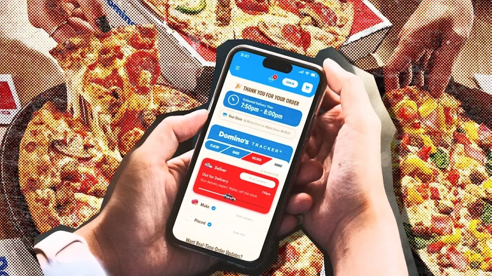
While companies cram artificial intelligence features you never asked for into their apps, Domino’s seems to have found a valid use case for the technology: more accurate tracking of when your pizza will be ready. When Domino’s launched its pizza tracker in 2008, it was a marvel of UX. The tracker gave customers a lens into when their pizza would be ready through a simple interface that lit up as the pizza progressed from ordered to baked to delivered. The tool turned Domino’s into a tech company, and inspired industries (and governments) to adopt the same UX for their own needs. Now, Domino’s made the biggest update to its pizza tracker in years. The new tracker features a simplified progress bar that shows just four stages of pizza creation. The new design was rolled out to all platforms, and there’s also new Lock Screen widgets for iOS that bring the pizza chain’s most famous tech feature to the Liquid Glass age. Behind it all is an AI model that the company says will give users the most accurate time estimates. Domino’s improved tracker uses a proprietary operating system it calls “DomOS” to better estimate orders through machine learning models that track real-time inputs, like what’s being ordered, how busy a store is at the time, how orders tend to cluster (like during a big sports game or commercial break), and what’s happening on the delivery side. “AI helps by looking at these signals together instead of isolation,” Domino’s vice president of global digital marketing Mark Messing tells Fast Company. “It learns from patterns we’ve seen before and continuously adjusts in real time as conditions change.” The company is promising more precise times for when pizzas will be ready for pickup or arrive for delivery. A rideshare-style interface shows a delivery driver as a car icon on a map like Uber that users can track in real time. For iOS users, the app’s Lock Screen widgets appear as Domino’s Tracker progress bar with an estimated delivery time. When an order is out for delivery, the progress bar becomes a car to show your pizza is mobile and delivery is imminent. The redesign was done by Dominio’s digital experience team in partsnership with their agency WorkInProgress. Domino domination Domino’s is the leading pizza chain nationally in the U.S. at a time when pizza sales are struggling. Pizza Hut’s parent company is considering a sale and announced the closure of 250 stores in February. Meanwhile Domino’s chief financial officer Sandeep Reddy said on the company’s last earnings call that Domino’s retail sales had grown 5.5% thanks to same-store sales, a promotion, and new specialty pizza flavors. Domino’s refreshed its brand last year with a new font, brightened color palette, and redesigned pizza boxes that play off the domino theme with dots. It also introduced what it calls a “cravemark,” or its tagline “mmm” expressed audibly through a jingle recorded by Shaboozey. Like its overhauled visual brand, the revamped pizza tracker shows that Domino’s is doubling down on what it’s best known for. Since the company introduced its tracker in 2008, it has tracked more than 2.5 billion orders. Domino’s original tracker was the first web-based pizza tracker in the industry, and it had a futuristic, skeuomorphic style with segments for each stage that lit up red or blue as a consumer’s order went from prep to delivery. The company gave users the options to customize their trackers in 2010 with six themes that they could use to reskin the progress bar. The company added GPS delivery tracking to the feature in 2019. The new tracker reduces the number of stages to just four—named “Placed,” “Make,” Deliver,” and “MMM”—while old names for stages like “Bake” and “Quality Check” are now gone. While the main progress bar is simplified, inside the app, there’s more specific information, like what time their order was placed in the oven and what time a delivery driver left the store. “The goal was flexibility without complexity,” Messing says. It’s an update that helps Dominos make the most of AI to be more dependable for customers. And at a time when delivery pizza sales are under pressure, that gives the company an edge with one of its best-ever marketing tools. View the full article
-
United Wholesale Mortgage lost ground to RKT in one category but held onto a healthy lead in another, an analysis of Home Mortgage Disclosure Act data shows. View the full article
-
Finance of America has not disclosed any incident, but a consumer filed an immediate lawsuit over a lone report of a ransomware gang's recent hack. View the full article
-
In female-driven industries, leadership misalignment shows up in the numbers long before it shows up in headlines. The aesthetics industry is built on women. It is fueled by their research, their spending, their vulnerability, and their trust. Yet the leadership shaping products, messaging, and capital allocation rarely reflects the consumer driving its growth. That structural gap compounds over time. Emotionally invested and financially decisive A 2024 Advanced Dermatology survey found women spend more than $1,000 per year on their appearance. The core aesthetics consumer researches cosmetic treatments for months, compares risks, reads reviews obsessively, and arrives at consultations informed and skeptical. She is emotionally invested and financially decisive. In most cases, the provider treating her will be male. Fewer than 20 percent of board-certified plastic surgeons in the United States are women. Within academic plastic surgery, female surgeons fill far fewer leadership roles, with only around 8 percent of departmental chairs held by women, reflecting persistent gaps in senior influence. These gaps distort how risk is communicated, misread cultural shifts, and quietly erode consumer trust. The disconnect becomes visible at global aesthetics conferences, where ballrooms filled with capital allocators, device manufacturers, founders, and surgeons look nothing like the consumer driving demand. Over dinner at one conference, I listened to a group describe a menopause panel moderated entirely by men. Men discussing hormone shifts, aging, and quality of life for women without a single woman with lived experience guiding the conversation. The unfamiliarity of female authority surfaces in subtler ways. On an early introductory call in my current role, a male client asked, “How did you get this job?” The tone reflected disbelief. It underscored how unusual female leadership can still feel in parts of this industry and how much energy women spend establishing credibility before focusing on execution. That energy has a cost. We see similar patterns beyond aesthetics. Even championship-winning women’s hockey teams are still treated as exceptions instead of authorities. Performance alone does not always translate into legitimacy when representation remains limited. Market reality Against that backdrop, RealSelf’s board made a deliberate decision. When they hired me as the first woman to lead a company that has served women for two decades, they were responding to a market reality. As the $44 billion aesthetics industry continues to scale, leadership alignment with the consumer becomes increasingly strategic. The decision came at an inflection point. RealSelf was 20 years old with significant brand authority, but revenue had plateaued and strategy lacked clarity. The company had history and recognition, yet it needed sharper direction. We rebuilt around clearer positioning and stronger operating discipline, expanded operating leverage, and returned the business to profitability. The balance sheet strengthened. The posture of the company shifted. With greater financial stability came the ability to invest decisively rather than defensively. Leadership alignment also affects internal momentum. When you occupy one of the rare seats at the table, awareness of that rarity sharpens focus. There is urgency to grow, to execute, and to outperform expectations. That competitive drive is visible across our leadership bench. Many of our strongest hires are exceptional operators who simply needed the opportunity to lead at scale. Given meaningful responsibility, they move quickly and build with conviction. We rebranded RealSelf to reflect the emotional and cultural reality of the consumer. In a category that has often leaned clinical in tone, we built a platform that feels informed, direct, and human. Consumers can ask, “Is this normal?” and expect clarity grounded in real experience. The results followed. Conversion is up 36 percent. Our brand partnerships pipeline has nearly tripled. We’ve added more than 317,000 email subscribers and 26,000 new social followers. Growth has been driven by resonance rather than heavy paid amplification. The cost of misalignment In trust-based industries, representation in leadership functions as infrastructure. Teams that mirror their market make more precise decisions about tone, risk, and long-term positioning. Misalignment tends to accumulate quietly through missed cultural cues and subtle erosion of credibility before it ever appears as a crisis. If you’re a board member or founder scaling a female-driven business, here’s the question worth considering: when did you last audit your leadership team against the consumer you’re building for? Not as a diversity exercise, but as a risk assessment. As aesthetics continues to grow, the companies that lead will be those whose leadership understands the lived complexity of their audience. Structural blind spots carry measurable consequences. In a $44 billion industry built on women’s trust, leadership alignment shapes outcomes. Representation at the top functions as a growth lever and a competitive advantage. View the full article

-
Donald The President renews threat to attack Iranian infrastructureView the full article
-
At last, Seedance 2.0 is now available in the U.S. This extraordinary generative video AI model made by TikTok’s Chinese parent company ByteDance is capable of creating high-definition video so realistic that it’s shattering our visual truth into a billion pieces. But hey, who cares? If we are going down in flames as a species, let’s have fun putting dumb videos together. I’ll tell you how to do it in this short guide on how to make Seedance 2.0 videos. Time to roll up for a Magical Mystery Tour. Step up right this way! Signing up for Higgsfield To use Seedance 2.0, you first need to sign up for Higgsfield. This platform is essentially a unified digital workspace that wrangles multiple artificial intelligence video engines—like Seedance, Veo, and Kling—into a single interface. Instead of paying for a dozen disjointed subscriptions, you get a centralized dashboard to use them all. To get started, you have to create an account and subscribe to either the Business ($49 billed monthly) or Ultra ($84) tier. If you happen to live outside the U.S. or Japan, prepare to jump through one extra hoop by verifying a corporate email address to unlock the model. Generating content on this platform runs through the typical credit economy. A standard 5-second clip rendered at 720p resolution burns 30 credits. Each credit costs from $0.04 to $0.08, depending on your subscription plan. To “celebrate” the End of Reality as We Know It, the company is currently offering 65% off at sign-up offer to lessen the initial financial blow. How Seedance 2.0 works Once you are in, you can select Seedance 2.0 from the main dropdown menu. Seedance 2.0 is multimodal, which means it accepts up to 12 simultaneous media inputs. You can upload nine static reference images, three distinct video snippets capped at 15 seconds each, and three audio tracks. It then spits out video shots (at 480p, 720p, 1080p or 2K resolution with upscaling) that max out at 15 seconds per generation. The model puts everything together, constructing the visuals, building up the characters (and maintaining coherent appearance between shots), moving the camera per your instructions, and syncing sound and speech at the exact same millisecond. The result is flawless lip-syncing and accurate spatial noise without needing a dedicated post-production pass (although professionals will actually integrate the results into dedicated editing software like Adobe Premiere). It is very simple to run, so go for it and give it a spin: Upload your reference files into the workspace and type out a plain-language description of what you want to see. After you hit generate, you will get your clip. If the platform defaults your output to 480p or 720p to save processing time, you can dive into the advanced settings to force a higher pixel count, or simply run the draft through their built-in upscaling tool to push it to a crisp 1080p or 2K finish. If you need a longer movie, you can click “extend” to chain multiple 15-second blocks together indefinitely. Craft the perfect prompt for Seedance 2.0 For best results, however, you need to follow some basic rules for writing prompts. Nothing hard, but you must use the following structure. First, start by explicitly defining your subject—their clothing, identity, and the surrounding environment—before moving on to the specific action and how long it should take. From there, you dictate the exact camera framing, such as a “slow dolly-in,” followed by the overall cinematic style and any strict constraints. Try to use positive instructions to describe what should exist on screen, entirely avoiding negative commands. Specificity is your best weapon against the AI’s natural tendency to hallucinate (although this model is really good at understanding the world). This is especially important for scenes with several characters that may get confused. Instead of just trying to control the “man,” talk about the “blonde man in a pink tutu” so the engine does not get confused. The smartest workflow here is to generate some short five-second screen tests first. If the resulting footage is slightly off, tweak only a single variable in your text prompt and regenerate, methodically isolating the problem rather than rewriting the entire scenario from scratch again and again. Once you are happy, build on that experience to create your final shot. Now go on, take out your credit card, and have fun destroying the planet and our brains! View the full article

-
Google's John Mueller answers question of whether splitting a sitemap is worth the extra work. The post Google Answers Why Some SEOs Split Their Sitemap Into Multiple Files appeared first on Search Engine Journal. View the full article
-
Allies of the former Labour leader are being drawn by ‘eco-populist’ pivot to the leftView the full article
-
The Artemis II mission now underway aims to send three Americans and one Canadian back to and around the moon, a journey that will mark humans’ farthest trek into space in decades. The program is one of a series of endeavors, including next-generation space stations, a lunar habitat, and even a manned Mars mission, that will vastly expand human presence in outer space. Critically, these missions are all certain to involve spacey versions of consumer technologies, which have now become a fixture of life in space. (Astronauts aboard the International Space Station use laptops and smartphones.) Yet such modern conveniences also create a host of IT issues. On the latest Artemis II mission, astronauts—again, also with smartphones—had to reach out to mission controllers experiencing issues on their systems. The culprit: Microsoft Outlook. Indeed, making computers work in space can be difficult. This includes issues related to the microgravity environment, as well as challenges related to communication networks, since signals back to Earth can be limited—and slow. There is, after all, no live tech support when you’re on the moon, or even Mars. “When we’re colonizing something like the moon or eventually going to Mars, I think it brings in lots of complexities,” Manoj Leelanivas, who serves as president of HP Solutions, which frequently works with NASA on in-space hardware, explains. “In the computer environment, typically you assume liquid cooling or air cooling. You look at the standard principles of convection, which don’t really apply in space. You have to deal with the radiation.” Fast Company chatted with Leelanivas about what it takes to build computers for space, and how that work might change as manned missions take on even more ambitious efforts. This interview has been edited for length and clarity. How is designing a workstation for space, or microgravity, different from designing a workstation for Earth? Let me start with, first of all, addressing unreliability and connectivity. In space, connectivity is not super reliable, which means compute has to really be close to data in supporting real-time decisions. You’ve got to add the compute horsepower and the GPU horsepower to make AI-based decisions locally, even without connectivity. That’s one of the capabilities that our flow workstations provide. They have huge elements of GPU capabilities, and you can even run 200-billion-parameter models. Some of them can even go higher than that. So that allows you to work in a non-connectivity environment. That’s important for flagging anomalies—quicker and faster—without waiting for the delay all the way to come back to Earth and whatnot. It’s not just about space, but down in the control room and beyond, you need to have data gathered in real time and have quick decisions made. What about computers on the moon? One of the biggest challenges the moon poses to us is that you can’t just quickly go and solve a problem. . . . You have to really plan, which means that you have more self-reliant systems—meaning systems that can break and recover. We think about: How can you actually process things as locally as possible? That’s slightly different from the Earth world, where we assume a lot of things in terms of redundancy and capabilities. How does HP see its relationship with private space companies? We are engaged with most of these companies without actually going into a specific name, because you’re not allowed to do that. Our workstations are the No. 1 workstations in these activities. The deep compute that is needed, and the modeling that is needed, and the history of looking at large amounts of telemetry data—those all put HP in a great position to work with many of these companies. . . . The only thing we are publicly talking about is this NASA relationship we have. What about orbital data centers? It’s always a good idea to think of new ways to solve problems in a business. . . . Energy is a big requirement for data centers. . . . If you go to space with the independent power of the sun, that can be harnessed. The energy may not be that difficult a problem in terms of energy-generation. But then it creates other problems, like: How do you cool your systems in an environment where convection doesn’t really work? It is definitely an aspirational idea, but at the same time, it’s a very meaningful one, because if we can solve data centers in space, it’ll solve a huge energy crisis, which is going to come in our future on Earth. How do you design AI for space? AI actually creates the opportunity for self-sustaining systems in space. . . . Machines are able to perform a lot of functions autonomously. We sometimes are injecting the human in the middle to make sure that certain things are done the right way, ethically. Sometimes, too much human intervention actually can slow down the AI process a little bit. . . . Sometimes, a high-powered, autonomous system within the guardrails is the right way to go. . . . You don’t have time for the back and forth. I do believe the work we’re doing, and the work a lot of other companies are doing, is enabling speed for the agents, with the models below [them]. . . . We are not only building great hardware and compute systems. We are also building technologies to bring them together quickly. View the full article

-
When the server walked past our table, my hand shot upward like a high schooler eager to answer the teacher’s question. “Can we get two more of the same, please?” I asked upon getting his attention. “Another round of espresso martinis? I got you, boss.” Leona grinned and nodded in approval, as expected. We go back like four flats on a Cadillac. From study buddies back at the G.O.A.T. HBCU to marketing professionals putting in work for thriving companies, we’ve remained a two-person support system. It’s a celebration every time we link up. So it’s only right that we throw back a few cocktails while getting our yap on. Sipping a boozy, caffeinated concoction at 2 p.m. on a Tuesday has a way of making me chatty. It also makes me wonder why more of my peers don’t observe the same tradition. Weeks before this rendezvous, Leona and I both planned to burn a day of PTO, coordinating our schedules like a couple of executives setting off for a retreat. Except the only agenda on this outing was tacos and real talk. We call it the skip day. The premise is simple: You and a friend both call out from your respective gigs for a workday hangout. This is not earmarked time for errands or spent couch rotting in solitude. It’s two (or more!) friends sharing a mental health day while the rest of Corporate America clocks in. Skip day is the adult version of faking sick in grade school, except you don’t have to fake anything. You just make sure you’re anywhere but your workplace. The skip day didn’t start as a formal thing. It evolved—the way most good traditions do—out of necessity. After weeks of failed meetups and playing calendar tag, we decided to multitask by coworking from a local Seattle café. We locked in, knocked off to-do lists, and squeezed in some kikis between tasks. It became a regular thing every few weeks. Eventually, we decided to cut the work part out altogether. For Leona and me, it has become a seasonal ritual, and this latest skip day reminded me why it’s so important. It’s a moment to mute Slack messages and email notifications while pouring into each other (and each other’s glasses). There, at that trendy Mexican restaurant, we traded career updates and inside jokes. Leona vented about her condescending-ass manager and celebrated the large-scale project she recently headed, wondering aloud what future opportunities it could unlock. My updates were familiar: the steady, sustaining drip of contractor work and the draining hunt for a full-time role. These topics are difficult to explain for people who haven’t lived it, but require no translation between us. We started with drinks and guacamole, but skip days have a way of extending themselves. One spot becomes two, two become three. By the time we sat down for dessert, the conversation had shifted from light stuff like weekend plans and what we’d been watching to the real stuff: politics, family, the future, the past. It was the kind of conversation that makes you feel like yourself again, without the need for corporate speak or code-switching. And something about doing that when you would otherwise be on your fourth Zoom meeting of the day makes it feel even more fulfilling. Skip day doesn’t have to be spent eating or drinking. Take a hike or a day trip. Go see a matinee. Do some window shopping. Hit up a botanical garden. The only limits are your imagination or budget. The magic is as much about where you’re not as where you are. Long ago, United Negro College Fund commercials taught me that a mind is a terrible thing to waste. The same could be said for PTO days spent on obligation or isolation (or even worse, not taken at all). Find that person who you vibe with like no other, someone who gets it, someone who fills you up. Pick a day you’re both free, outside of intense deadlines or work duties. And just show up for each other. You probably need it more than you think. View the full article

-
Amid the usual barrage of new launches around this time of year from the likes of Samsung and Xiaomi, I’ve been checking out the highest-end device yet from a manufacturer many readers won’t have heard of—but it’s one that marks an unusual collaboration with another brand that might be more familiar. Infinix is a sub-brand of Chinese company Transsion, which also owns the smartphone maker Tecno. The manufacturer is particularly successful in developing smartphone markets like Africa and the Middle East; across all of its brands, Transsion accounts for about half of Africa’s smartphone market share, according to figures from Canalys last year. Infinix largely targets young consumers in the markets where it operates. Its ultra-popular Hot series is designed to be affordable and stylish, while the Note is a step up in performance and functionality. The new Note 60 Ultra, however, is Infinix’s first attempt to compete in truly premium terms. The spec sheet By global standards, the Note 60 Ultra doesn’t really justify the “Ultra” designation if you look at its spec sheet, though it’s certainly at the high end of what Infinix typically produces. It’s based on a midrange MediaTek Dimensity 8400 Ultimate system-on-chip, topping out at 512GB of storage and 12GB of RAM. The camera setup, meanwhile, is capable but cuts corners. The main camera uses a reasonably sized 200-megapixel sensor, backed by a 50-megapixel 3.5x telephoto and a pokey 8-megapixel ultrawide. Results are fine for the price point, but you might expect more from something with Ultra in the name. It’s harder to pick nits with the display—you get a 6.78-inch 144Hz 2644-by-1208 OLED panel, which looks great in any environment. There’s also a very high-capacity silicon-carbon battery at 7,000mAh (milliampere-hours) that can be charged at up to 100 watts, getting you a 50% charge in about 18 minutes, and there’s support for wireless charging at 50 watts. Stand-out design But where Infinix is really aiming to stand out is with the design. The company partnered with Pininfarina, the Italian car design house that’s probably best known for its collaborations with Ferrari—including the iconic F40 and Enzo. This is the first time Pininfarina has worked with a smartphone brand, and you can see the evidence of supercar styling all over the Note 60 Ultra. The most conspicuous element is the “uni-chassis” camera bump that stretches across the entire top third of the phone. The whole construction is covered by a single opaque piece of glass, obscuring the actual camera hardware. The bottom edge of the camera module is highlighted by a red LED that flashes on for notifications and is reminiscent of sports car taillights. The right side of the camera module houses another surprise: a low-resolution monochrome active-matrix display. This can be used to display the time, the weather, battery charging status, basic minigames or simply a cute pixel-art pet on the back of your phone. It’s similar to what Nothing has done with some of its recent devices, but rather than being the focal point of the industrial design, the display is completely invisible when not in use. The rest of the Note 60 Ultra’s back panel is finished off in Kevlar-style fiberglass, which would not be my first pick on another device but feels appropriate enough here given the car influence. The overall effect of the phone’s construction is remarkably sleek and coherent. Charger as paperweight Perhaps the most ostentatious result of the Pinanfirina collaboration—yes, even more so than the camera bump taillight—is the bundled wireless charger. This is a weighty slab of vaguely car-shaped metal that would effectively serve as a classic desktop paperweight. It has a little more utility than that, though, housing an included magnetic wireless charging puck. It might not be the most efficient use of desk space but I admit it does look quite cool. Overall, Infinix has proven that it can produce a well-made flagship-adjacent device with the help of Pinanfirina. The Italian firm’s contributions to the Note 60 Ultra go well beyond previous automotive collaborations we’ve seen in the industry, like OnePlus with McLaren or Huawei with Porsche Design. The question, though, is whether anyone will actually buy it. Right now the Note 60 Ultra is available only in Malaysia for an equivalent price of around $750, far beyond what people are normally willing to pay in Infinix’s strongest markets. Even outside of those, it’s getting into iPhone territory, and the Android competition is fierce at this pricing tier. It seems unlikely that Infinix ever intended to ship the Note 60 Ultra in large volumes; the wireless charging stand alone means it comes in an impractically huge box. Instead, it’s probably best thought of as a Pinanfirina design study that serves as a halo device for a brand with higher aspirations. Taken on those terms, it’s surprisingly effective; I’ll be watching to see whether Infinix can bring some of this design sensibility to more mass-market products. View the full article

-
In today’s marketing environment, visual content plays a vital role in capturing and retaining audience attention. By utilizing examples like infographics, engaging videos, and interactive content, you can simplify complex ideas and encourage user participation. Moreover, incorporating memes, user-generated content, and personalized visuals improves relatability and drives engagement. Comprehending how each format can impact your strategy is fundamental, as it allows you to strengthen your brand’s presence. Let’s explore these effective visual content types further. Key Takeaways Infographics simplify complex information and enhance retention, making them ideal for conveying data-driven insights in marketing strategies. Engaging videos boost conversion rates and viewer retention, capturing attention faster than text and driving higher engagement on social media. Interactive content, like visual checklists and choose-your-own-adventure formats, significantly increases user interaction and retention rates. Memes and user-generated content enhance brand relatability and authenticity, particularly appealing to younger demographics and driving social media engagement. Social media stories utilize disappearing content to increase user interest, with interactive features boosting participation and engagement significantly. Infographics: Simplifying Complex Information Infographics are strong tools that can simplify complex information, making it easier for audiences to understand and retain essential data. In visual content creation, infographics effectively combine visuals, colors, and layouts, guiding viewers through intricate topics. Research shows they’re 30 times more likely to be read than text-only content, improving audience comprehension. With a 94% increase in views compared to text-heavy formats, infographics are particularly valuable in digital marketing, where attention spans are short. Additionally, they’re shared on social media three times more often than other visual content examples, boosting brand visibility. When designed effectively, infographics can establish trust and strengthen brand authority, showcasing data-driven insights that resonate with your audience. Engaging Videos: Capturing Attention In relation to capturing attention in today’s fast-paced digital environment, engaging videos stand out as one of the most effective tools available. They can boost conversion rates by up to 80%, making them crucial for influencing purchasing decisions. Research highlights that 85% of consumers are more likely to buy after watching a product video. Moreover, social media posts with videos generate 1200% more shares than those with just text and images. Considering that video content is processed 60,000 times faster by the brain than text, it’s clear why incorporating videos into your marketing strategy is key. Benefit Statistic Increased Conversion Rates Up to 80% Purchase Likelihood 85% after watching a video Shareability 1200% more than text/images Information Processing Speed 60,000 times faster Interactive Content: Encouraging Participation When you incorporate interactive content into your marketing strategy, you greatly improve user engagement and participation. Research indicates that interactive elements like quizzes and polls can increase user interaction by up to 80%. These visuals often generate twice the engagement compared to static content, leading to more shares on social media. By utilizing formats like choose-your-own-adventure, you allow users to tailor their experiences, which strengthens their connection to your brand. Brands that leverage interactive content report a 70% increase in user retention, as participants are more likely to return for new experiences. Furthermore, visual checklists and interactive infographics simplify complex information, promoting active engagement and ensuring users understand and retain your key messages effectively. Memes: Adding a Relatable Touch Memes have become a substantial component of modern marketing strategies, as they effectively connect brands with their audiences in a relatable manner. By incorporating memes into your marketing, you can achieve notable benefits, such as: Increased engagement by up to 60% compared to standard content. Improved brand personality, making your brand more relatable and humanized. Greater visibility, as memes are shared 2.5 times more often than text-only content. Stronger appeal to younger demographics, with 75% of Gen Z and millennials enjoying brands that use memes. When selecting or crafting memes, make certain they align with your brand’s voice, as 78% of consumers prefer brands that reflect their sense of humor. This approach can greatly amplify your marketing efforts. User-Generated Content: Building Community User-generated content (UGC) plays an important role in building community around your brand by strengthening loyalty and encouraging authentic engagement. When you showcase community stories through UGC, you not only improve relatability but additionally promote a sense of belonging among your audience. This strategy can greatly boost engagement and conversion rates, making UGC a vital component of your marketing efforts. Strengthening Brand Loyalty Incorporating user-generated content (UGC) into your marketing strategy can greatly improve brand loyalty by nurturing a sense of community among consumers. Here are key benefits to evaluate: Increased authenticity: Campaigns featuring UGC resonate as more genuine, with 79% of people acknowledging this reflection of brand authenticity. Higher engagement: UGC boosts social media interaction by 28%, enhancing your brand’s visibility. Stronger connection: Brands that engage with UGC experience a 20% increase in customer retention, making consumers feel valued. Cost-effective content: Utilizing UGC can cut content creation costs by up to 50%, allowing for better resource allocation. Encouraging Authentic Engagement When brands encourage authentic engagement, they create an environment where customers feel empowered to share their personal experiences, nurturing a deeper connection to the brand community. User-generated content (UGC) plays a crucial role in this process. By featuring real customers, you not just improve brand visibility but also cultivate trust and loyalty. UGC Benefits Impact on Engagement Increased trust 79% of consumers influenced More visibility 4.5x more likes Higher engagement rates 28% increase Improved community feeling 6.9x more comments Incorporating UGC in your marketing strategy can greatly influence purchasing decisions and strengthen community ties, making your brand more relatable and accessible. Showcasing Community Stories Showcasing community stories can greatly boost a brand’s connection with its audience, as it allows customers to see themselves reflected in the brand’s narrative. By incorporating user-generated content (UGC) into your marketing strategy, you can improve authenticity and drive engagement. Here are some key benefits of showcasing community stories: Boosts Authenticity: 79% of consumers feel UGC influences their purchasing decisions. Increases Engagement: UGC leads to a 28% higher engagement rate on social media. Fosters Loyalty: 79% of customers are more likely to support brands that highlight community stories. Improves Conversion: Brands using UGC can see a 4.5% increase in conversion rates. Utilizing community stories effectively can greatly strengthen your brand’s online presence. Motion Graphics: Enhancing Information Delivery Motion graphics serve as a strong tool for simplifying complex concepts, allowing you to present information in a visually engaging way. By incorporating dynamic elements and storytelling techniques, you can boost audience retention rates markedly, making your content more memorable. Whether you’re using them in social media, websites, or videos, motion graphics can effectively improve your message and keep viewers interested. Simplifying Complex Concepts Visual content plays a crucial role in simplifying complex concepts, particularly through the use of motion graphics. By combining dynamic visuals with text, motion graphics can make intricate ideas more engaging and comprehensible. Here are some key benefits of using motion graphics: Increased Retention: People retain 65% of information presented through visuals versus just 10% from text alone. Enhanced Engagement: Videos with motion graphics draw up to 50% higher engagement rates on platforms like YouTube. Improved Comprehension: Motion graphics reduce cognitive load, allowing viewers to process information more easily. Boosted Effectiveness: Incorporating motion graphics can increase viewer retention by 80%, enhancing your overall communication strategy. Utilizing these techniques can greatly enhance your marketing efforts. Engaging Visual Storytelling Techniques When you want to communicate complex ideas effectively, engaging visual storytelling techniques can be your best ally. Motion graphics combine animated visuals and text, simplifying information and enhancing comprehension. They increase viewer retention by up to 95% compared to text-only content. By incorporating motion graphics in your presentations, you can boost audience engagement by as much as 80%. Furthermore, these visuals can lead to a 50% increase in conversion rates, capturing attention more effectively than static images. Brands using motion graphics experience sharing rates up to 1200% higher than traditional formats. Benefit Percentage Increase Viewer Retention 95% Audience Engagement 80% Conversion Rates 50% Sharing Rates 1200% Boosting Audience Retention Rates Incorporating engaging elements like motion graphics can greatly improve audience retention rates. By adding dynamic visuals, you capture attention and boost comprehension. Here are some benefits of using motion graphics: Increased Retention: Motion graphics can boost retention by up to 80% compared to static images. Visual Learning: With 65% of people being visual learners, it effectively conveys complex information. Higher Engagement: Presentations with motion graphics see a 70% rise in viewer engagement. Improved Shareability: Videos featuring motion graphics are shared 1200% more than text and images combined. Social Media Stories: Creating Urgency and Engagement Social media stories have emerged as a potent tool for brands looking to create urgency and boost engagement with their audience. With 62% of users expressing increased interest after viewing stories, these formats drive higher interaction rates. The ephemeral nature of stories encourages immediate engagement, as 58% of users prefer content that disappears within 24 hours. Brands leveraging stories can experience a 33% increase in engagement compared to traditional posts. Incorporating interactive features like polls and quizzes can improve participation by up to 50%. A vast majority, around 86% of marketers, recognize stories as an essential part of their strategy. Engagement Factor Percentage Increase User Interest 62% Immediate Engagement 58% Interactive Features Boost 50% Data Visualization: Presenting Insights Clearly Data visualization plays a crucial role in transforming complex datasets into clear, accessible graphics that help audiences grasp insights quickly. Using effective data visualization techniques can greatly improve your marketing strategy. Here are some key benefits: Infographics can boost information retention rates by 70% compared to text-only formats. Charts and graphs simplify comparisons and trends, as people remember 80% of what they see and do. Interactive visualizations, like dashboards, increase user engagement and comprehension by 60%. Articles with relevant visuals attract 94% more views than text-only content. Incorporating these strategies into your marketing materials guarantees your audience understands and retains important insights, ultimately enhancing your overall effectiveness in communicating key messages. Visual Checklists: Guiding Decision-Making Visual checklists can profoundly improve your decision-making clarity by presenting vital information in an organized manner. By streamlining complex processes, these tools help you comprehend key points quickly and effectively, making it easier to retain important details. Incorporating visual checklists into your marketing strategy can’t merely enhance audience engagement but likewise facilitate a more efficient comprehension of your content. Enhancing Decision-Making Clarity In an era where information overload can hinder effective decision-making, visual checklists emerge as a potent tool to simplify complex processes. By presenting information in a digestible format, these checklists can improve comprehension and retention by up to 60%. Here’s how you can leverage visual checklists for clarity: Incorporate visuals to boost engagement; visually-driven content is shared 40 times more frequently than text. Use color-coding to prioritize tasks and guide you through steps, reducing cognitive overload. Tailor checklists to your audience for focused relevance, especially in fields like healthcare. Follow clear, actionable steps to increase task completion rates by 28%. Utilizing visual checklists can greatly improve your decision-making clarity. Streamlining Complex Processes Effective decision-making often requires maneuvering through layers of complexity, and visual checklists serve as a practical solution to streamline these processes. By breaking down tasks into clear, actionable steps, these checklists improve clarity and focus, making it easier for you to navigate complex decisions. Research shows that incorporating visuals can boost memory retention by 65% and improve task completion rates by up to 30%. Using color coding and icons further enhances usability, facilitating quick recognition. Visual checklists are especially effective in digital environments, allowing for easy sharing and collaboration. Here’s a quick overview of their benefits: Benefit Description Improved Clarity Breaks down tasks into manageable steps Increased Engagement Visuals boost retention and interest Higher Completion Rates Improves task completion by up to 30% Quick Recognition Color coding aids in navigation Collaborative Sharing Easy access across platforms for teams Personalized Visuals: Tailoring Messages for Impact Even though many brands use standard images in their marketing campaigns, incorporating personalized visuals can dramatically improve audience engagement. By tailoring your visuals, you can create messages that resonate more effectively with your audience. Here are some strategies to contemplate: Leverage Audience Data: Use demographics and preferences to craft relevant images. Include Interactive Elements: Add quizzes or personalized recommendations to boost interaction. Utilize High-Quality Graphics: Invest in custom visuals to stand out and capture attention. Encourage Social Sharing: Design shareable content that resonates, increasing your reach considerably. Personalized visuals lead to higher click-through rates and are preferred by 91% of consumers, making them essential for effective marketing. Tailoring your visuals not only improves engagement but also nurtures deeper connections with your brand. Frequently Asked Questions How Does Visual Content Enhance Marketing? Visual content improves marketing by increasing engagement and comprehension. When you use images, your posts can receive 150% more interactions than text-only ones. Infographics break down complex information, making it easier for your audience to understand. Videos boost conversion rates by summarizing product features quickly, leading to more shares. High-quality visuals likewise reflect your brand’s identity, nurturing trust and loyalty among consumers. Engaging visuals can humanize your brand and broaden its reach. How to Visualise a Marketing Strategy? To visualize a marketing strategy, you can use various tools like flowcharts to outline the customer path, highlighting key touchpoints. Infographics simplify complex data, allowing stakeholders to quickly grasp insights. Mind maps help you brainstorm and organize ideas hierarchically, encouraging collaboration. Visual timelines track milestones and deadlines, keeping your team aligned. Moreover, data visualizations such as charts and graphs present performance metrics, enabling you to analyze results and adjust strategies effectively. What Is a Visual Content Strategy? A visual content strategy is a plan that aligns your visual storytelling with marketing goals. It defines the purpose of each content piece and guarantees it resonates with your target audience. By setting clear metrics, like engagement rates, you can measure effectiveness. Incorporating various formats, such as infographics and videos, helps cater to audience preferences. Consistency in branding elements strengthens recognition and trust, as audience insights guide your creative process for improved relevance. What Is a Visual Representation of Marketing Strategy? A visual representation of a marketing strategy includes tools like infographics, flowcharts, and data visualizations that simplify and convey complex information. These visuals clarify the customer path, illustrating each touchpoint effectively. You can likewise use charts to showcase performance metrics, helping to evaluate campaign success. Furthermore, storyboards map out content ideas cohesively, whereas interactive visuals engage your audience, nurturing deeper connections with your brand and enhancing their overall experience. Conclusion Incorporating diverse visual content into your marketing strategy can greatly improve your effectiveness. By using infographics, engaging videos, and interactive elements, you can simplify complex information and boost audience participation. Memes and user-generated content nurture community, as social media stories create urgency. Furthermore, data visualization and visual checklists help present insights clearly, guiding decision-making. Personalized visuals guarantee your messages resonate with individual preferences. Overall, these strategies can improve engagement, comprehension, and brand visibility in a competitive environment. Image via Google Gemini and ArtSmart This article, "10 Visual Content Examples to Elevate Your Marketing Strategy" was first published on Small Business Trends View the full article